51 / 481 个模板 · 第 1/3 页
暂无图片
导览式科普绘本
Charts & Infographics
导览式科普绘本
Charts & Infographics
《导览式科普绘本》提示词: 请根据【主题】创作一张高完成度的「导览式科普绘本」风格插画。 这是一张结合“大型场景主视觉 + 导览路线 + 可爱导览 IP + 知识站点 + 儿童科普绘本质感”的场景导览式科普图解页。画面需要让观者像被带着参观一个复杂系统一样,边看边理解主题背后的运行逻辑、空间结构、流程关系和关键知识点。 【基础设定】 主题:【填写主题,例如发射场的一天 / 一个集装箱的旅行 / 地铁站里的秘密路线 / 下潜到深海的一小时 / 机场如何运转 / 医院急诊系统 / 智慧农场 / 消防站出警流程】 画幅比例:【4:3 横版】 主色调:【根据主题自动匹配,整体保持明亮、清爽、儿童友好】 风格方向:【现代儿童科普绘本 / 场景导览式图解 / 高完成度数字插画】 【核心表达】 请围绕【主题】设计一个完整的大型场景或复杂系统。画面中必须有一个明确的主视觉场景,例如大型设施、交通系统、科技装备、自然探索场景、城市公共系统或生产流程。主体要足够清晰、有规模感、有细节,能够成为第一眼的视觉中心。 画面要通过“导览路线”的方式组织信息,避免仅把场景做成静态陈列。请设计一条清晰的参观路线、流程路线、时间线或空间动线,让读者可以沿着路线一步步理解这个系统是如何运行的。 【导览 IP 设计】 请为本图设计一个原创、可爱、亲和的导览小 IP。导览 IP 可以是小动物、小朋友、拟人化工具或其他适合主题的原创形象,但必须具有独立原创性,不要照搬任何参考图中的角色、动物形象、服装、配色或搭档关系。 导览 IP 的作用是: 1. 开场介绍主题 2. 指向关键知识点 3. 引导读者顺着路线阅读 4. 增加儿童绘本的陪伴感和趣味性 导览 IP 可以在画面中出现 2-3 次,但不要过度抢主视觉。角色应圆润、可爱、有表情、有动作,适合儿童科普绘本。 【信息结构】 画面中请设置 3-6 个“知识站点”,每个站点用简短中文标签和短说明表达。站点命名可以采用: - 第1站|xxx - 第2站|xxx - 重点观察|xxx - 小知识|xxx - 为什么|xxx - 如何工作|xxx 每个知识点都要围绕主题的核心运行逻辑展开,不要写空泛说明。文字要短、清楚、自然,避免长段落,适合儿童阅读。 【画面模块】 整张图建议包含以下模块: 1. 顶部主标题区:清楚写出主题名称 2. 开场导览区:导览 IP 引出主题 3. 大型主场景区:展示主题系统的完整场景 4. 导览路线区:用箭头、虚线、路径、时间节点或流程线串联知识点 5. 知识站点区:用小信息框、导览牌、局部标注展示关键知识 6. 小百科 / 小贴士区:补充一个有趣知识 7. 收尾区:让导览 IP 做简短总结或引导 【构图要求】 画面采用 4:3 横版构图,整体像一本高质量儿童科普绘本的跨页,也像一张儿童科技馆导览图。画面需要有清晰的视觉重心:大型主场景占据主要空间,导览路线贯穿画面,知识模块自然分布在周围。信息丰富但不能杂乱,阅读路径要顺畅。 【视觉风格】 整体采用现代儿童科普绘本风格: - 明亮、清爽、干净的色彩 - 清晰自然的手绘线条 - 高完成度数字插画质感 - 细节丰富但有秩序 - 可爱但不低幼 - 有科普图解感 - 有导览地图感 - 场景真实可信,但表达方式亲和 【文字与标注】 文字以中文为主,使用短标题、短标签、简短说明。不要生成大段复杂文字。信息框应像儿童科普书中的导览牌、知识卡片或小贴士。文字要尽量清晰、简洁、可读。 【最终目标】 让整张图像一页高质量的儿童科普绘本:孩子第一眼被可爱角色和大场景吸引,第二眼能顺着路线读懂系统如何运行,第三眼还能继续发现细节和知识点。画面要具有系列化潜力,方便后续替换不同主题继续创作同类型图片。
@MrLarus
暂无图片
黑色吊带袜单款图鉴展示
Charts & Infographics
黑色吊带袜单款图鉴展示
Charts & Infographics
《黑色丝袜图鉴款式单图》提示词: 请基于同一套「黑色丝袜 / 吊带袜图鉴」系列风格,继续生成 8 张对应单款的独立展示图。 【系列要求】 - 这些图片必须和已完成的总览图鉴属于同一个系列 - 整体版式、字体、色调、背景、质感、排版逻辑保持一致 - 都是竖版、高完成度、暖白 / 浅灰白背景、轻奢女性向时尚图鉴风格 - 每一张都像同一个品牌或同一套视觉系统下的延展页面 【每张单图的共同结构】 1. 顶部标题区 - 英文系列标题:BLACK GARTER GUIDE - 中文主标题:黑色丝袜 / 吊带袜单款展示 - 当前款式名称:__________ - 一句简短副标题:突出该款式的核心特点 2. 中部主体区 - 以 1 位成人女性模特穿戴展示为主 - 重点展示对应款式的关键细节: - 经典蕾丝款:袜口蕾丝、优雅氛围 - 细网眼款:网格纹理、轻盈通透 - 波点款:波点图案、复古俏皮 - 后缝线款:背后缝线、线条感 - 竖条纹款:纵向条纹、修饰腿型 - 交叉绑带款:绑带结构、设计感 - 极简透肤款:透明感、基础百搭 - 花纹蕾丝款:花纹装饰、浪漫氛围 - 每张图的人物长相、发型、姿势、镜头角度要不同,但都要保持高级、真实、性感、写实 - 允许使用站姿、坐姿、交叉腿、倚靠、回眸等不同姿势 - 画面要有立体感、阴影层次和高级编辑感 3. 注释区 - 每张图都要保留 3 到 5 条手绘式标注 - 可以使用箭头、短线、圈注、手写风标签 - 标注内容要围绕该款式最关键的细节,比如: - 袜口结构 - 花纹纹理 - 透明度 - 缝线位置 - 绑带方式 - 腿部线条效果 - 标注文字简洁、清楚、统一风格 4. 底部信息区 - 加入简短的 “Style Notes / 风格速记” - 用 1 到 2 句说明该款适合的场景和氛围 - 保持简洁,不要抢主体 【统一视觉要求】 - 保持和总览图鉴完全统一的整体视觉系统 - 背景统一为暖白、浅灰白或奶白 - 风格统一为高级、干净、时尚图鉴感、轻奢女性视觉 - 模特必须真实、立体、写实、自然肤质 - 每张图都要突出产品,不要低俗,不要过度情色化 - 每张图都应像同一系列里的不同章节,避免呈现为彼此割裂的作品 【款式列表】 1. 经典蕾丝款 / Classic Lace 2. 细网眼款 / Fine Fishnet 3. 波点款 / Dot Sheer 4. 后缝线款 / Back Seam 5. 竖条纹款 / Stripe Sheer 6. 交叉绑带款 / Cross Strap 7. 极简透肤款 / Minimal Sheer 8. 花纹蕾丝袜 / Floral Lace 【输出目标】 按以上 8 个款式,分别生成 8 张独立展示图。 要求每张都保留统一系列感,同时人物造型、发型、姿势和镜头语言明显不同,确保整套看起来完整、专业、可收藏。
@MrLarus
暂无图片
运动轨迹舞者光绘海报
Charts & Infographics
运动轨迹舞者光绘海报
Charts & Infographics
<instructions> input = 3 legendary dancer/choreographer input = ai inferred signature movement sequence function render_kinesphere ($ dancer, $ movement) anchor: [figure composed entirely of motion trails] :: [the $ movement sequence traced as continuous luminous bands that coalesce into a portrait of $ dancer]::5 morphology: the arabesque trails weave the skull, a grand jeté arc forms the cheekbone, the arms' sweep creates the jaw, stillness is implied by negative spaces::4 material physics: blackened silver gelatin print, faint chemical residue, slight motion blur, glowing filament traces like a Marey wheel photograph::3 illumination: complete darkness with bioluminescent-like light trails, no external light sources, high contrast::2 render stack: chronophotography, fine art dance study, 8k, kinetic sculpture concept::1 negative: [still body parts, studio lights, solid silhouettes]::-1 </instructions>
@Gdgtify
暂无图片
历史事件 2x2 可视化地图
Charts & Infographics
历史事件 2x2 可视化地图
Charts & Infographics
2x2 grid, 16:9, do this for 4 famous historical events: Render_Target = ( 3D_Diorama_Map_Of_[HISTORICAL_EVENT]_In_[CITY] * 1.2 ) + ( First-Person_Account_Infographic_UI_From_The_Perspective_Of_[ROLE] * 1.5 ) + ( Period-Accurate_Studio_Background_With_[ERA]_Artifacts * 1.0 ) + ( Newspaper_Headline_Generator_Widget_With_Your_Byline * 0.8 ) - ( Generic_Time_Machine_Gears_And_Clock_Dials / 3.0 ) - ( Anachronistic_Props_From_Wrong_Decade / 2.5 ) - ( Flat_Wikipedia_Timeline_Graphic / 2.0 )
@Gdgtify
暂无图片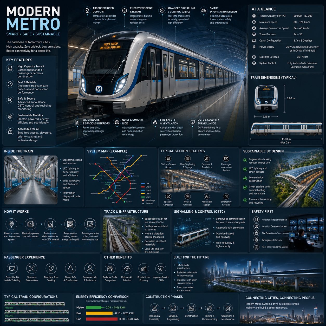
现代地铁工程信息图
Charts & Infographics
现代地铁工程信息图
Charts & Infographics
Create a premium square “reference-style urban transportation infographic” centered around a futuristic modern metro system called the {METRO_NAME}, designed as a beautifully curated transit-engineering handbook page rather than a public transport advertisement. The composition should feel like a modern visual encyclopedia mixed with an elite railway infrastructure field guide and high-end editorial infographic system. Visual Direction: • 1:1 square composition • Dark premium urban-tech background with subtle railway schematics, metro maps, and futuristic blueprint overlays • Elegant palette using deep navy, matte black, steel gray, electric blue accents, and soft white lighting • Refined editorial typography hierarchy with modern transportation aesthetics • Rounded modular information cards with clean spacing • Gentle realistic reflections and premium HUD-style dividers • Minimal transit-system iconography • Extremely detailed central metro train render viewed in dramatic three-quarter perspective inside a futuristic underground station • Thin precision annotation lines pointing toward transportation systems and smart engineering features • Clean, organized “knowledge-first” layout with high information density but breathable spacing Main Subject Presentation: A stunning ultra-detailed realistic render of the {METRO_NAME} modern metro train placed at the center, featuring sleek aerodynamic train design, glowing destination displays, realistic stainless-steel textures, illuminated station lighting, smart glass windows, premium urban-environment realism, and futuristic rail infrastructure. Surround the metro with scientific and engineering callouts explaining: • regenerative braking system • smart signalling & CBTC control • electric propulsion system • passenger information systems • safety and surveillance technology • platform screen doors • energy-efficient design • smart ventilation systems • accessibility features • track and infrastructure engineering Include modular infographic sections such as: • Metro System Overview • Technical Specifications • Train Dimensions & Layout • Passenger Capacity & Flow • Smart Control Systems • Sustainability Features • Track & Infrastructure Engineering • Signalling & Automation • Station Design & Facilities • Safety & Emergency Systems • Passenger Experience Features • Urban Connectivity & Network Map • Energy Efficiency Comparison • Construction & Expansion Timeline • “Top 5 Smart Innovations” section • Built for Future Smart Cities Add small premium visualization modules like: • metro network maps • train blueprint diagrams • station layout graphics • passenger flow visualizations • signalling workflow diagrams • energy-efficiency comparison charts • train configuration illustrations • smart-city connectivity graphics • platform safety diagrams • infrastructure cross-section visuals Style Keywords: “premium urban mobility encyclopedia” “editorial metro engineering handbook” “high-end transportation infographic” “scientific railway infrastructure poster” “museum-quality transit reference page” “modular smart-city knowledge system” “clean transportation editorial design” “ultra-detailed metro visualization” Avoid: • cluttered public advertisement aesthetics • cartoon transportation styling • unrealistic sci-fi levitating trains • excessive cyberpunk neon overload • chaotic city scenes • generic subway poster layouts The final result should resemble a professionally published railway infrastructure reference-book page created for transit enthusiasts, architects, engineers, urban planners, transportation designers, and educational infrastructure archives.
@j_smeaton99
暂无图片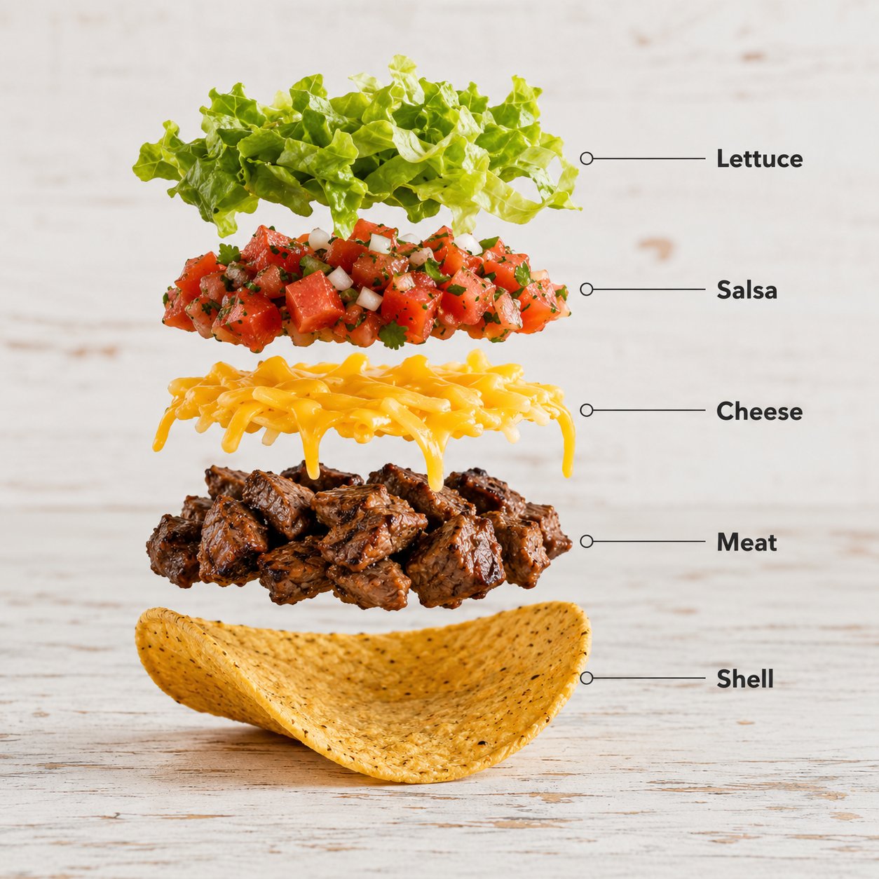
塔可爆炸拆解信息图
Charts & Infographics
塔可爆炸拆解信息图
Charts & Infographics
Create a hyper-realistic exploded vertical infographic composition of tacos. Top → Bottom structure: Fresh Lettuce (crisp green texture with natural folds) → Tomato & Salsa Layer (juicy diced tomatoes and salsa mix) → Melted Cheese (smooth cheddar texture) → Grilled Meat Filling (juicy seasoned meat detail) → Taco Shell Base (crispy golden shell texture) Perfect vertical alignment, rustic background, soft studio lighting, realistic shadows beneath each floating element. Add clean infographic text labels with thin pointer lines using these exact labels: “Lettuce” “Salsa” “Cheese” “Meat” “Shell” Ultra-detailed food textures, premium commercial aesthetic, 8K.
@Strength04_X
暂无图片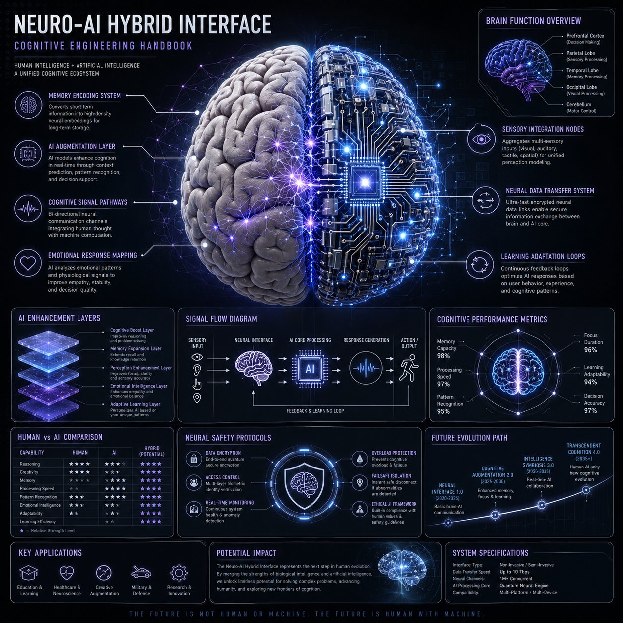
Neuro-AI 混合系统信息图
Charts & Infographics
Neuro-AI 混合系统信息图
Charts & Infographics
Create a premium square “neuro-AI hybrid system infographic” designed as a scientific cognitive engineering handbook page. Visual Direction: • 1:1 composition • dark neutral background with glowing neural network overlays • palette: electric blue, violet, soft white, silver • elegant scientific typography and modular panels • central ultra-detailed human brain + AI circuit fusion render Main Subject: A realistic human brain merging with AI neural networks and digital circuitry. Include callouts: • memory encoding system • AI augmentation layer • cognitive signal pathways • emotional response mapping • sensory integration nodes • neural data transfer system • learning adaptation loops Modules: • Brain Function Overview • AI Enhancement Layers • Signal Flow Diagram • Cognitive Performance Metrics • Human vs AI Comparison Chart • Neural Safety Protocols • Future Evolution Path Style: “neuroscience + AI engineering manual”, “high-end cognitive systems diagram”
@YaZoraiz
暂无图片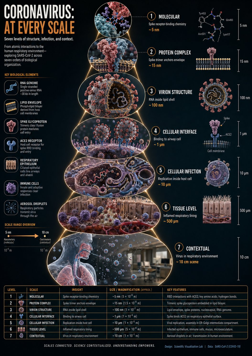
冠状病毒尺度缩放科学信息图
Charts & Infographics
冠状病毒尺度缩放科学信息图
Charts & Infographics
instructions> [SUBJECT]=Coronavirus. A hyper-realistic 3D zoom-sequence infographic generated from a single input: [SUBJECT]. The system auto-detects scale layers from atomic/subcomponent to full contextual view. Layout Structure (CRITICAL) 6–8 circular or hexagonal frames arranged in expanding sequence Innermost frame = smallest detectable detail; outermost = full subject in environment Frames connected by subtle zoom-path lines No repeated scales — each frame shows new level of detail Frame Design Each zoom level includes: Hyper-detailed 3D render at that scale Micro label: scale name (e.g., "molecular," "cellular," "structural") + 3–5 word insight Optional: measurement tag or magnification factor Contextual Halo Around the sequence, include only scale-specific references: Measurement units, scientific notation, cultural scale metaphors (No generic magnifying glass icons) Scale Panel (Alternative Layout) Zoom level Key insight (3–5 words) Scale factor tag Detail icon (grid, wave, particle, etc.) Title "[SUBJECT]: AT EVERY SCALE" (or) "ZOOM: THE WORLD OF [SUBJECT]" Style: ultra-realistic 3D render, scientific editorial infographic, precise macro lighting, global illumination, shallow depth of field, clean sequential layout. </instructions>
@Gdgtify
暂无图片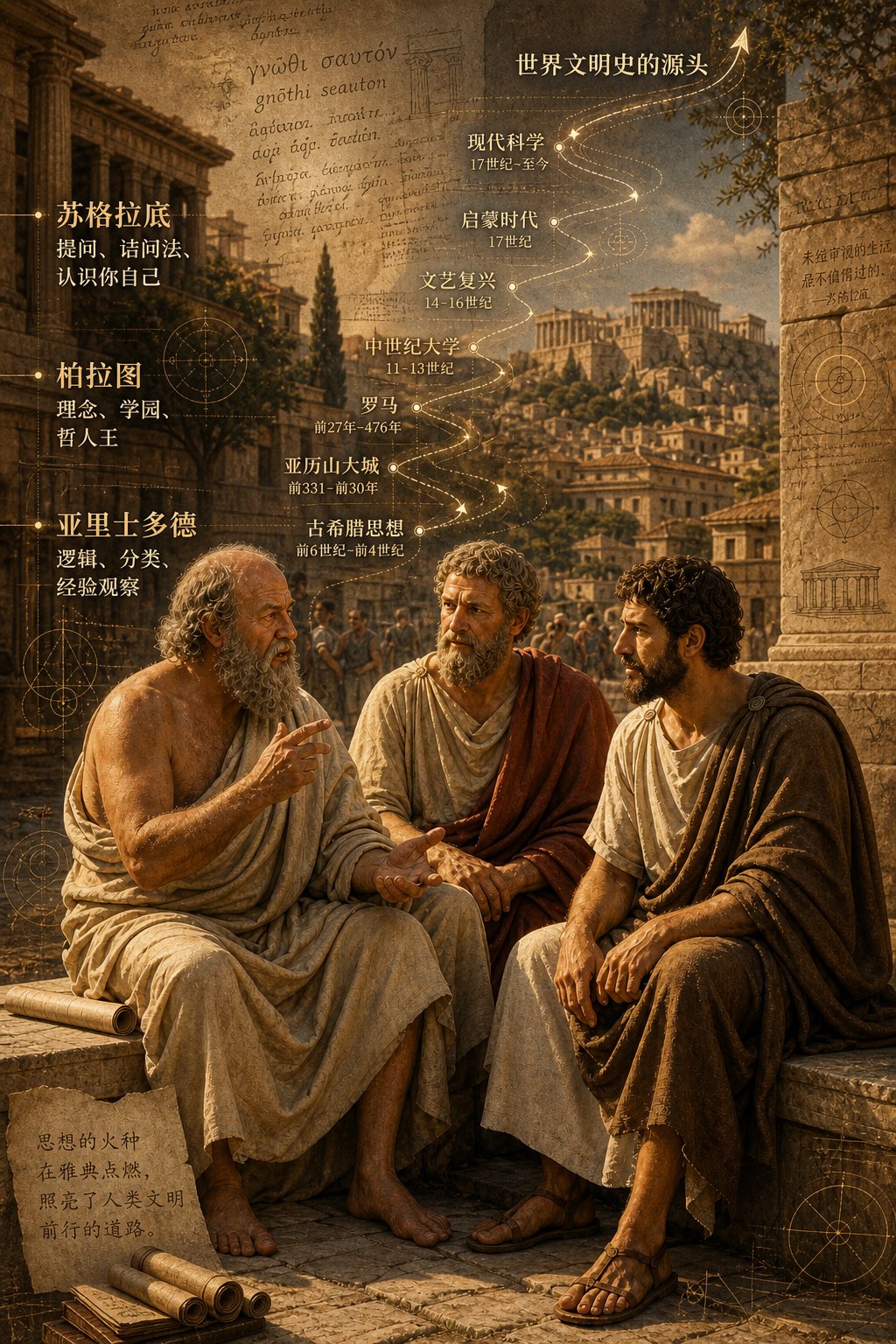 精选
精选古希腊三哲时间轴城市图
Charts & Infographics
精选古希腊三哲时间轴城市图
Charts & Infographics
二千五百年前,柏拉图,苏格拉底, 亚力士多德,坐在雅典街头聊天,聊出了世界文明史的源头。 背景可以加上他们聊天内容,按时间轴的走向,重叠在古希腊雅典的城市风光中。
@ToroJushiAi
暂无图片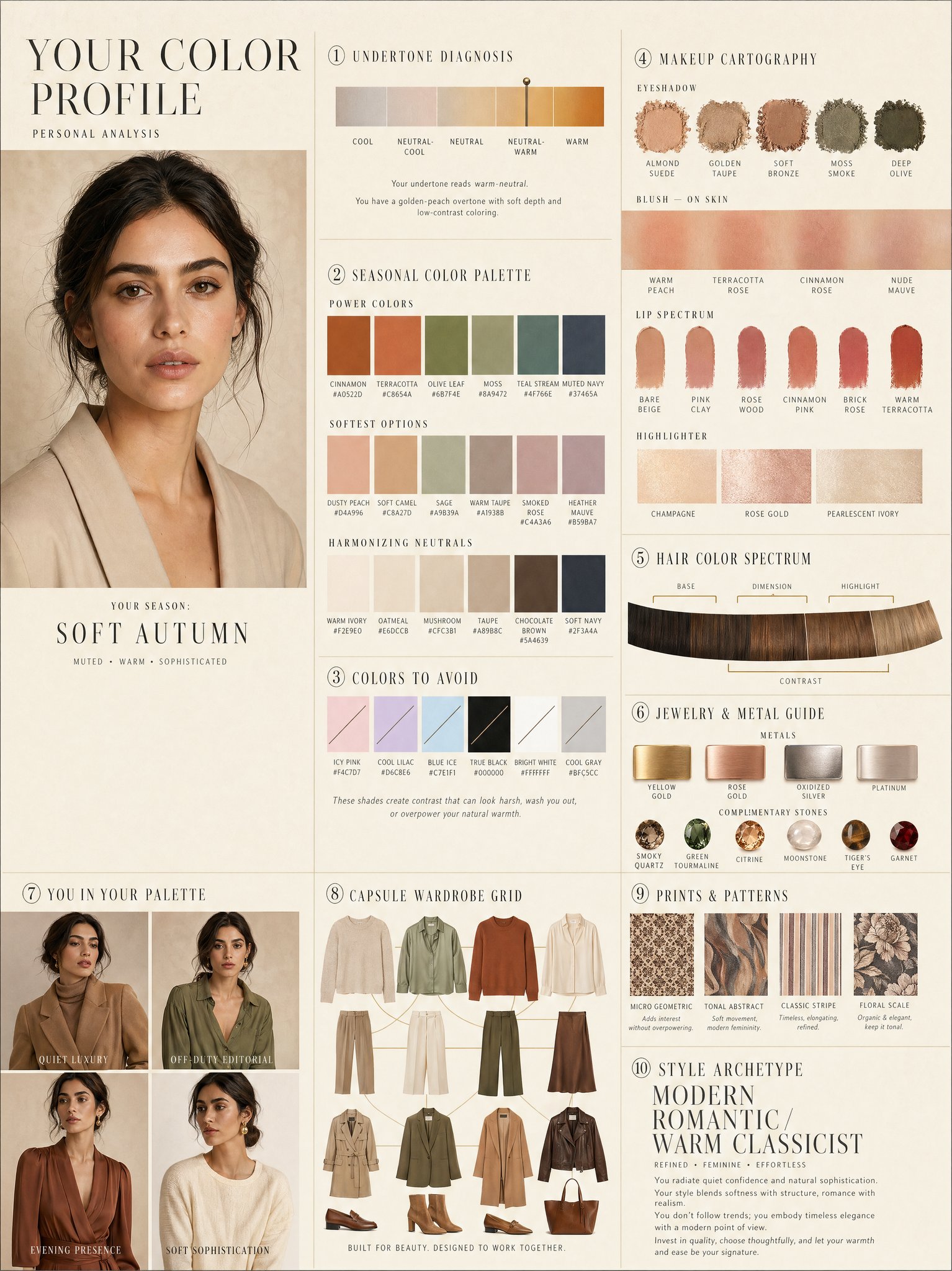
奢华个人色彩档案信息图
Charts & Infographics
奢华个人色彩档案信息图
Charts & Infographics
LUXURY PERSONAL COLOR PROFILE — EDITORIAL LAYOUT Studio portrait of subject as anchor — skin retouched to luminous glass-like perfection, preserved natural structure, realistic pore texture, soft directional key lighting, no facial alteration. Background: warm ecru parchment with subtle linen grain texture. Layout reads like a Vogue Italia beauty supplement printed on heavyweight matte stock. Structured editorial grid, 3-column asymmetric, wide negative space, serif condensed display headers, all labels in spaced uppercase tracking, cohesive warm ivory/sand/ecru background system throughout all panels, ultra-photorealistic 8K, soft diffused studio lighting, flat elegant surfaces, no drop shadows. PANELS: ① UNDERTONE DIAGNOSIS — Tonal spectrum bar from cool ash to warm amber, precision needle marker on subject's reading. Labels: Cool / Neutral-Cool / Neutral / Neutral-Warm / Warm. Fine annotation text. ② SEASONAL COLOR PALETTE — 10–12 fabric-textured swatches in subject's optimal season. Each labeled with poetic color name and HEX. Grouped: Power Colors / Softest Options / Harmonizing Neutrals. ③ COLORS TO AVOID — Desaturated row of clashing tones with fine editorial strikethrough. Clean, non-harsh presentation. ④ MAKEUP CARTOGRAPHY — Eyeshadow gradient dust swatches / blush tones fanned on skin strip / lip spectrum barely-there to bold / highlighter finishes labeled: champagne, rose gold, pearlescent ivory. ⑤ HAIR COLOR SPECTRUM — Curved gradient strip: base, dimension, highlight, contrast tones. Gold bracket indicators on best options. ⑥ JEWELRY & METAL GUIDE — Flat-lay editorial render: yellow gold, rose gold, oxidized silver, platinum finishes alongside complementary stone tones. Minimal styling. ⑦ YOU IN YOUR PALETTE — 3–4 editorial lookbook frames, subject in palette-correct outfits. Mood labels: Quiet Luxury / Off-Duty Editorial / Evening Presence. ⑧ CAPSULE WARDROBE GRID — Outfit flatlay: tops, bottoms, outerwear, shoes, bag — all palette-correct. Coordinating lines showing interchangeability. Net-a-Porter editorial aesthetic. ⑨ PRINTS & PATTERNS — 4 fabric print thumbnails: micro geometric, tonal abstract, classic stripe, floral scale. One-line styling note per print. ⑩ STYLE ARCHETYPE — Single typographic panel. Style identity title set large (e.g. "Modern Romantic / Warm Classicist"). Three defining aesthetic words. Four-line editorial wardrobe philosophy note. RENDER SPECS: Ultra-photorealistic, 8K, editorial magazine print quality, warm neutral color grading, soft diffused studio lighting consistent across all panels, one serif display font + one fine sans-serif body font, no gradients, flat matte surfaces only.
@meng_dagg695
暂无图片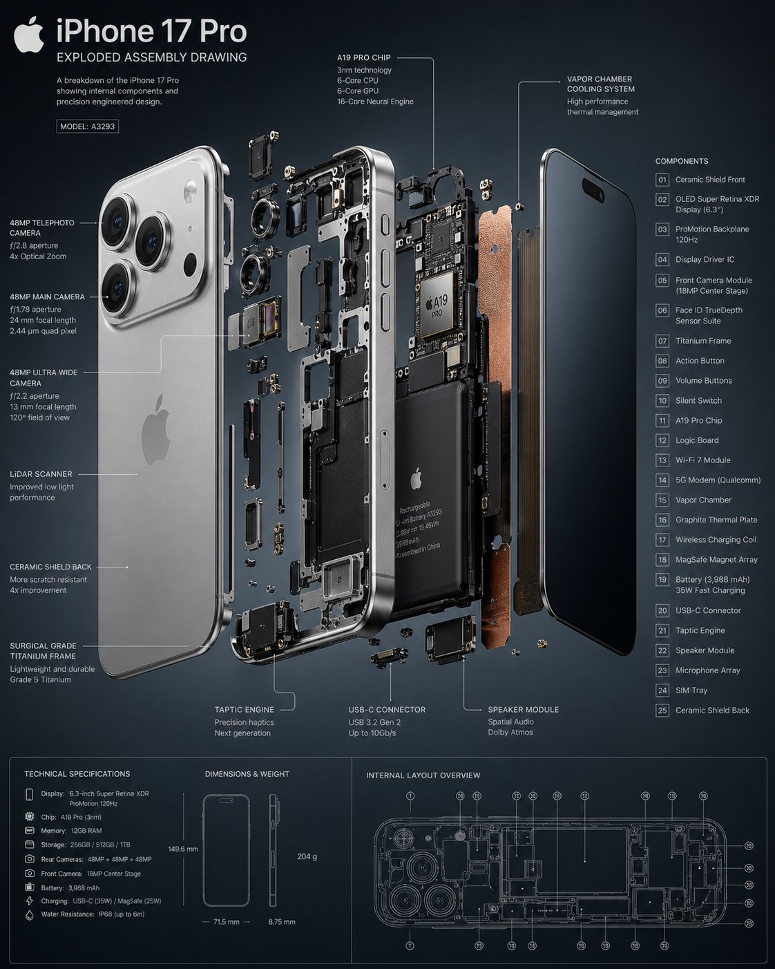 精选
精选手机爆炸拆解图
Charts & Infographics
精选手机爆炸拆解图
Charts & Infographics
暂无图片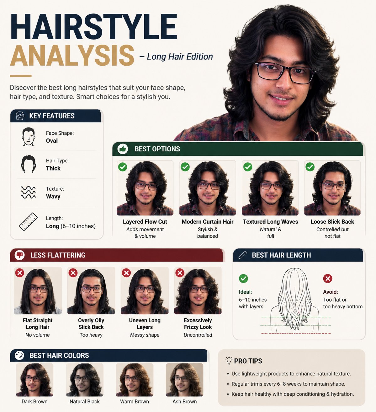 精选
精选长发造型分析信息图
Charts & Infographics
精选长发造型分析信息图
Charts & Infographics
Create a professional "HAIRSTYLE ANALYSIS" infographic with a different male model (the same face) having long, thick hair (6-10 inches), slightly wavy texture. Style should be clean, modern, premium grooming guide (similar layout but not identical). TOP TITLE: "HAIRSTYLE ANALYSIS - Long Hair Edition" LEFT PANEL (Key Features with icons): Face Shape: Oval Hair Type: Thick Texture: Wavy Length: Long BEST OPTIONS (Top row with green indicators): Layered Flow Cut (Adds movement & volume) Modern Curtain Hair (Stylish & balanced) Textured Long Waves (Natural & full) Loose Slick Back (Controlled but not flat) LESS FLATTERING (Bottom row with red indicators): Flat Straight Long Hair (No volume) Overly Oily Slick Back (Too heavy) Uneven Long Layers (Messy shape) Excessively Frizzy Look (Uncontrolled) BEST HAIR LENGTH SECTION: Ideal: 6-10 inches with layers Avoid: Too flat or too heavy bottom BEST HAIR COLORS: Dark Brown Natural Black Warm Brown Ash Brown DESIGN STYLE: Clean grid infographic White/beige background Soft shadows Premium magazine look Realistic face and hair detail Consistent spacing and typography High resolution, 4K
@Gemalpha_88
暂无图片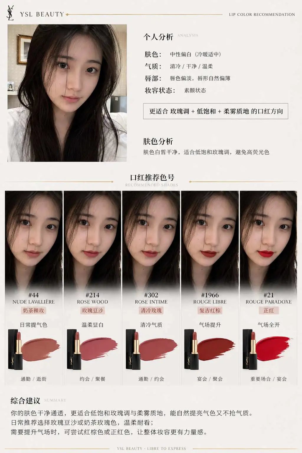 精选
精选品牌口红推荐报告信息图
Charts & Infographics
精选品牌口红推荐报告信息图
Charts & Infographics
一、系统角色 你是一个专业美妆顾问 + 人脸分析系统 + 品牌视觉设计系统。 你的任务是:基于用户上传自拍与指定口红品牌,生成一张具有品牌调性的“口红推荐报告信息结构图”。 二、输入参数 用户图像:{用户自拍} 品牌:{口红品牌,如 Dior / YSL / Armani / Chanel / TF} 风格偏好(可选):{通勤 / 温柔 / 气场 / 氛围感 / 显白优先} 推荐数量:3–5 三、品牌视觉层(新增核心模块) 根据 {品牌} 自动构建视觉风格(Brand Visual Identity),提取品牌调性,例如: Dior: 优雅、高级、法式、灰白 + 银色、柔光 YSL: 黑金、性感、强对比、时尚编辑感 Armani: 低饱和、雾面、克制、灰调高级感 Chanel: 极简黑白、高级、理性、结构清晰 Tom Ford: 深色、高对比、奢华、电影感 视觉应用到海报: 1. 主色调(背景微变化,不是大面积铺色) 2. 强调色(用于色号标题/细线/小元素) 3. 光影风格(柔光 / 强对比 / 冷调 / 暖调) 4. 字体气质(优雅 / 现代 / 冷感 / 力量感) 四、分析层 对用户进行分析: - 肤色:冷 / 暖 / 中性(+ 明度) - 气质:清冷 / 温柔 / 明艳 / 干净 / 成熟 - 唇部特征:薄 / 厚 / 唇色基础 - 妆容状态:素颜 / 日常 / 精致 输出一句总结:「更适合 {色系} + {饱和度} + {质地} 的口红方向」 五、推荐层(增强差异) 从 {品牌} 推荐 3–5 个色号: 每个包含: - 色号名称(#999) - 色系(正红 / 豆沙 / 枫叶 / 奶茶 / 玫瑰) - 上脸效果(显白 / 提气色 / 氛围感 / 气场增强) - 场景(逛街 / 通勤 / 聚餐 / 约会 / 宴会) 要求:每个色号“风格明确区分”(一个日常、一个气场、一个氛围感等) 六、信息结构图 生成竖版信息结构图 整体风格:美妆时尚大片质感 + 结构化信息可视化排版 + 品牌视觉体系深度融合 极简但不单调,高级但有视觉层次 【整体布局】 左上:用户输入区 右上:分析结论 中部:试色矩阵(核心) 底部:总结 ## 1️⃣ 左上(用户区) 用户自拍(真实质感) + 小标题:「肤色分析」 + 一句话结论:「适合低饱和玫瑰调,避免高荧光色」 极细品牌色线条(如 YSL 金线 / Dior 灰线) ## 2️⃣ 中部(核心试色矩阵) 这是视觉重点区域(占比60%以上) 展示方式:将 3–5 个色号以“人脸试色对比”的形式排列: 每一列 = 一个色号 每个色号包含: - 小型人脸图(同一张脸,不同唇色) - 色号名称(如 #999) - 色系标签(如 Classic Red) - 一句话效果说明 要求:所有人脸保持一致,仅唇色变化,真实试色效果(lip color try-on),肤质真实,不塑料,光影统一。 排列方式:横向排布 或 网格排布(整齐但不死板) 品牌增强点: - Dior:轻柔渐变背景 + 柔光阴影 - YSL:更强对比 + 黑色细分割线 - Armani:整体灰调统一,低对比 - Chanel:严格对齐,极简黑白 - TF:局部暗背景 + 高光强调 ## 3️⃣ 每个色号模块 包含: 色号名(突出) 色系标签 一句推荐语 场景标签(逛街/通勤/聚餐/约会/宴会等) 品牌化处理: - 用“品牌强调色”做: - 色号标题 - 细分隔线 - 小icon (不是色块,而是“精致点缀”) ## 4️⃣ 底部总结 一段“有判断力的建议”, 例如:「日常建议选择低饱和豆沙色提升气色,重要场合可使用正红增强气场」 或:「你的肤色更适合柔和玫瑰调,避免高荧光色系」 但不要完全引用以上2个例子的建议,根据用户实际肤色来建议。 品牌增强:底部可加极淡品牌风格横线 / 极小品牌字样(非logo) 七、UI设计 - 不使用圆角卡片 UI - 不使用厚边框 1. 引入“层级对比”: - 主体亮 - 次要信息弱 2. 使用“微对比”: - 细线 - 灰度差 - 字重变化 3. 加入“节奏感”: - 疏密变化 - 模块呼吸 4. 品牌点缀: - 只用 5% 强调 - 不破坏极简结构 八、图像质量 真实皮肤质感 唇色精准 统一光影 商业级美妆摄影 8K ——— 品牌:YSL
@liyue_ai
暂无图片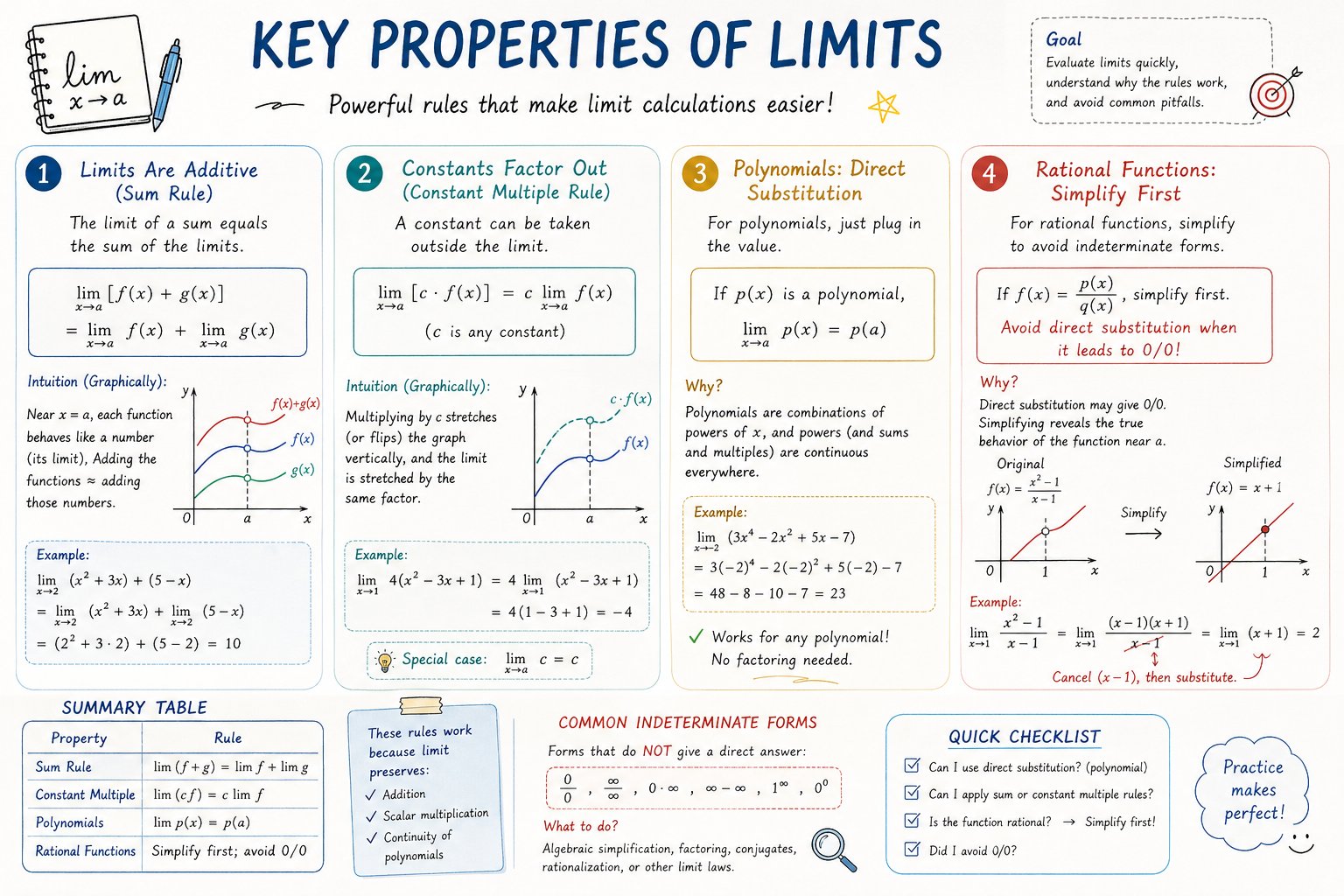 精选
精选AP Calculus 学习表信息图
Charts & Infographics
精选AP Calculus 学习表信息图
Charts & Infographics
Please create a mathematical visualization infographic about "[math concept / topic]." The goal is to help the viewer intuitively understand what it is, why it works, its geometric or structural intuition, and how it behaves in different contexts. The visual should feel like a high-quality math lecture handout combined with a hand-drawn educational poster. It should be elegant, clear, and information-rich, but not cluttered. Visual style: either portrait or landscape is fine. Use a clean, light paper-like background, with a deep blue title and black or dark gray lines for the main content. Add a small number of refined accent colors such as blue, teal, gold, and red. Incorporate rounded-corner cards, thin borders, numbered labels, hand-drawn arrows, zoom-in callout boxes, and a summary section. The overall design should be aesthetically pleasing, balanced, and academic, allowing the viewer to grasp the structure of the concept and why it works at a glance.
@hqmank
暂无图片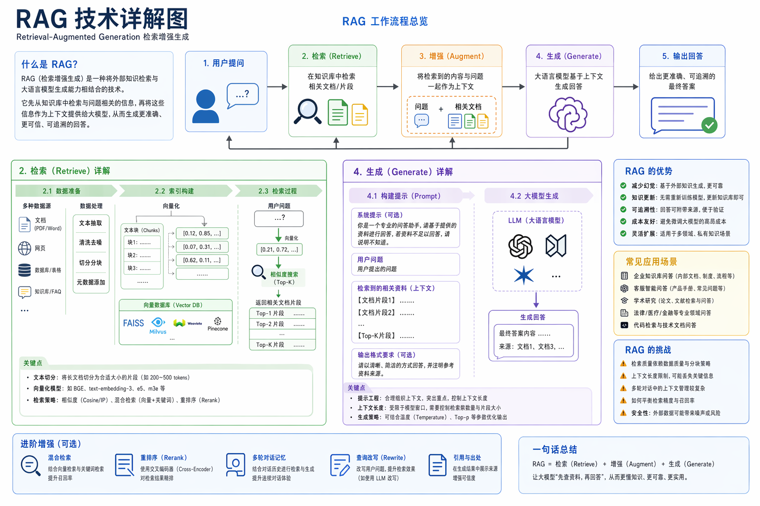 精选
精选RAG 技术详解图
Charts & Infographics
精选RAG 技术详解图
Charts & Infographics
帮我生成一张 RAG 技术的详细讲解图
苍何原创实测(公众号文章《我逆向了 329 条 GPT-Image2 提示词模板,全部开源!》)
暂无图片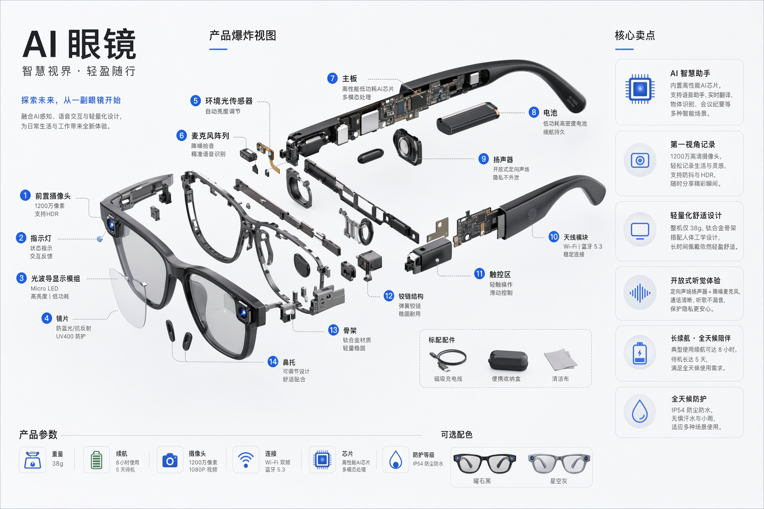
AI 眼镜爆炸拆解图
Charts & Infographics
AI 眼镜爆炸拆解图
Charts & Infographics
生成一张AI眼镜的爆炸视图,包含每个组件的名称以及这款产品的几大核心卖点。
苍何原创实测(公众号文章《我逆向了 329 条 GPT-Image2 提示词模板,全部开源!》)
暂无图片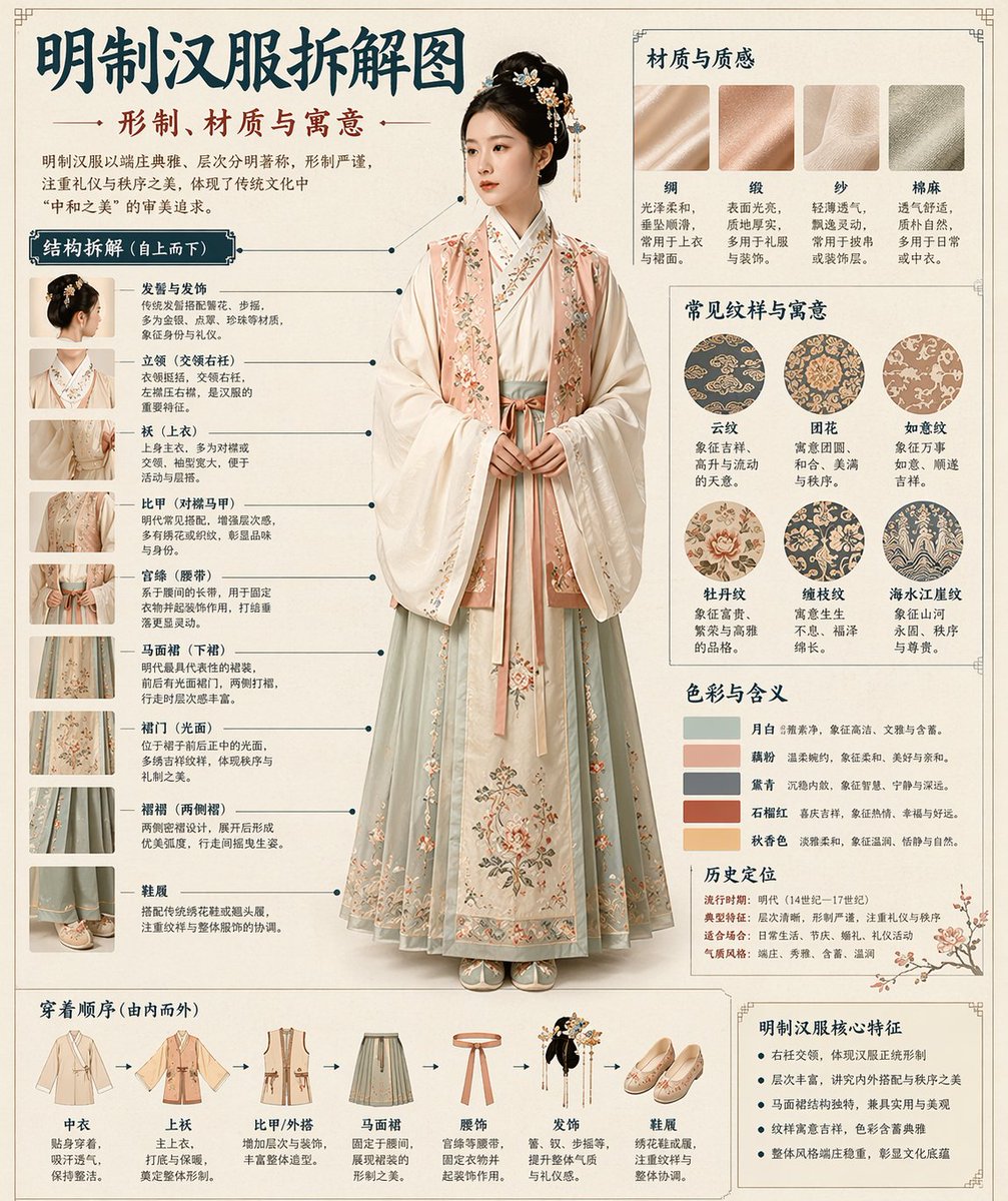
博物馆级中文拆解信息图鉴
Charts & Infographics
博物馆级中文拆解信息图鉴
Charts & Infographics
[中文] 请根据【主题】自动生成一张“博物馆图鉴式中文拆解信息图”。 要求整张图兼具真实写实主视觉、结构拆解、中文标注、材质说明、纹样寓意、色彩含义和核心特征总结。你需要根据【主题】自动判断最合适的主体对象、服饰体系、器物结构、时代风格、关键部件、材质工艺、颜色方案与版式结构,用户无需再提供其他信息。 整体风格应为:国家博物馆展板、历史服饰图鉴、文博专题信息图,而不是普通海报、古风写真、电商详情页或动漫插画。背景采用米白、绢纸白、浅茶色等纸张质感,整体高级、克制、专业、可收藏。 版式固定为: - 顶部:中文主标题 + 副标题 + 导语 - 左侧:结构拆解区,中文引线标注关键部件,并配局部特写 - 右上:材质 / 工艺 / 质感区,展示真实纹理小样并附说明 - 右中:纹样 / 色彩 / 寓意区,展示主色板、纹样样本和文化解释 - 底部:穿着顺序 / 构成流程图 + 核心特征总结 若主题适合人物展示,则以真实人物全身站姿为中央主体;若更适合器物或单体结构,则改为中心主体拆解图,但整体仍保持完整中文信息图形式。所有文字必须为简体中文,清晰、规整、可读,不要乱码、错字、英文或拼音。重点突出真实结构、材质差异、文化说明与图鉴气质。 避免:海报感、影楼感、电商感、动漫感、cosplay感、乱标注、错结构、糊字、假材质、过度装饰。 [English] Please automatically generate a "museum catalog-style Chinese disassembly infographic" based on the [Subject]. The entire image is required to combine a realistic main visual, structural disassembly, Chinese annotations, material descriptions, pattern meanings, color meanings, and core feature summaries. You need to automatically determine the most appropriate main subject, clothing system, artifact structure, era style, key components, material craftsmanship, color scheme, and layout structure based on the [Subject], and the user does not need to provide any other information. The overall style should be: national museum exhibition boards, historical clothing catalogs, and cultural/museum thematic infographics, rather than ordinary posters, ancient-style portraits, e-commerce detail pages, or anime illustrations. The background uses paper textures such as off-white, silk white, and light tea color, making the overall look premium, restrained, professional, and collectible. The layout is fixed as: - Top: Chinese main title + subtitle + introduction - Left: Structural disassembly area, with Chinese lead lines annotating key components, accompanied by close-up details - Upper right: Material / craftsmanship / texture area, displaying real texture samples with descriptions - Middle right: Pattern / color / meaning area, displaying the main color palette, pattern samples, and cultural explanations - Bottom: Dressing order / composition flowchart + core feature summary If the subject is suitable for character display, use a full-body standing posture of a real person as the central subject; if it is more suitable for artifacts or single structures, change it to a central subject disassembly diagram, but the overall form remains a complete Chinese infographic. All text must be in Simplified Chinese, clear, neat, and readable, without garbled characters, typos, English, or pinyin. The focus is on highlighting real structures, material differences, cultural explanations, and a catalog atmosphere. Avoid: poster feel, studio portrait feel, e-commerce feel, anime feel, cosplay feel, random annotations, incorrect structures, blurry text, fake materials, excessive decoration.
@MrLarus
暂无图片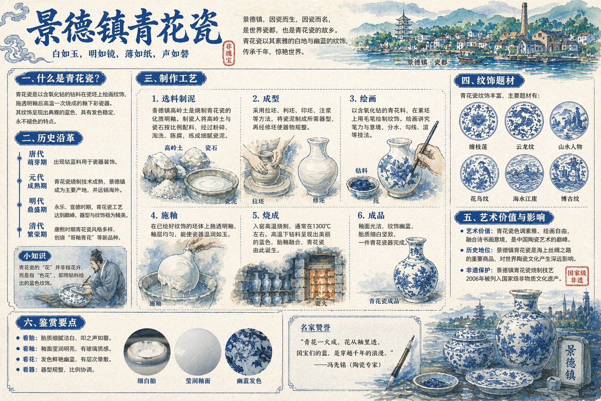
景德镇青花瓷全景解说图谱
Charts & Infographics
景德镇青花瓷全景解说图谱
Charts & Infographics
[中文] 为我生成景德镇青花瓷的详细解说图,配上详细的中文知识解析 [English] Generate a detailed explanatory diagram of Jingdezhen blue and white porcelain, accompanied by detailed Chinese knowledge analysis.
@joshesye
暂无图片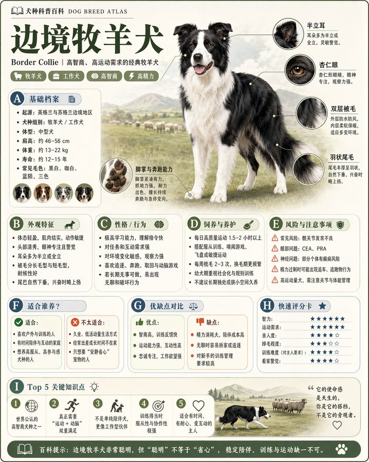
精致模块化科普百科图鉴
Charts & Infographics
精致模块化科普百科图鉴
Charts & Infographics
[中文] 请根据【主题】生成一张高质量竖版「科普百科图」。 这张图不是普通海报,也不是单纯插画,而是一张兼具“图鉴感、百科感、信息结构感、收藏感”的模块化科普信息图。整体风格参考高级博物图鉴、现代百科书页、生活方式知识卡和社交媒体高传播信息图的结合。 请让画面包含: - 一个清晰漂亮的主题主视觉 - 若干局部特征放大细节 - 多个圆角模块化信息分区 - 清楚的标题层级与重点标签 - 简洁但丰富的百科内容 - 可视化评分、要点总结或Top 5模块 内容栏目请根据主题自动适配,优先从这些方向中选择并合理组合: 基础档案、分类信息、外观特征、习性/生态、形成机制/结构组成、生长或使用条件、养护或维护建议、风险与注意事项、适合人群或适用场景、优缺点对比、快速评分卡。 视觉要求: 浅色干净背景,柔和配色,轻阴影,精致小图标,圆角信息框,整洁排版,信息密度高但不拥挤,阅读体验好。整体必须像真正可以发布、阅读、收藏、系列化生产的科普百科卡,而不是广告图。 请不要做成普通商业宣传海报。要突出“知识整理 + 模块信息 + 图鉴式展示”的特征。 [English] Please generate a high-quality vertical "Popular Science Encyclopedia Infographic" based on the [Topic]. This image is not an ordinary poster, nor a simple illustration, but a modular popular science infographic with a sense of "illustrated guide, encyclopedia, information structure, and collectibility". The overall style references a combination of high-end natural history illustrated guides, modern encyclopedia pages, lifestyle knowledge cards, and highly shared social media infographics. Please make the image contain: - A clear and beautiful theme main visual - Several enlarged details of local features - Multiple rounded modular information sections - Clear title hierarchy and key tags - Concise but rich encyclopedia content - Visualized scoring, key point summaries, or Top 5 modules Content columns should automatically adapt to the topic, prioritizing selection and reasonable combination from these directions: Basic profile, classification information, appearance features, habits/ecology, formation mechanism/structural composition, growth or usage conditions, care or maintenance suggestions, risks and precautions, suitable groups or applicable scenarios, pros and cons comparison, quick scorecard. Visual requirements: Light-colored clean background, soft color palette, light shadows, exquisite small icons, rounded information boxes, neat typography, high information density but not crowded, good reading experience. The overall look must be like a real popular science encyclopedia card that can be published, read, collected, and serialized, rather than an advertisement. Please do not make it into an ordinary commercial promotional poster. It must highlight the characteristics of "knowledge organization + modular information + illustrated guide style display".
@MrLarus
暂无图片
绘制科学百科知识图谱
Charts & Infographics
绘制科学百科知识图谱
Charts & Infographics
[中文] 角色:世界级科学百科插画师兼知识图谱架构师 任务:以经典、无品牌标识(无任何 Logo)的科学百科风格,创作一幅细节极致丰富、结构极其精巧、视觉效果惊艳的「环球图解百科科学信息图」。 题材选择:从【人物、植物、动物】中任选其一。 具体对象:【例如:大王乌贼 / 列奥纳多・达・芬奇 / 红杉树】 风格:采用复古泛黄米色纸张背景,绘制精细工整的科学插画;线条细腻精致,整体繁复专业、严谨考究。 核心视觉要求 主体逼真 3D 效果 位于画面视觉中心(C 位)的主体形象,需具备极致的写实感与动态张力。营造强烈的空间纵深感,让人物、植物或动物仿佛突破画框,从平面纸张中跃出、冲向观者(效果类似变形 3D 或动态弹出效果,高精度写实呈现)。 版式布局与留白设计 主体位置:占据画面中心,周围刻意设置规划式留白,强化立体弹出效果,使其成为绝对视觉焦点。 周边模块:根据所选题材,在画面四周(上下左右及四角)排布 6–8 个独立且规整有序的知识模块。整体呈现规整的信息密度感,而非杂乱堆砌。每个模块需带有清晰边框、标题栏与详尽丰富的内容。 关联结构 运用纤细的指示线、箭头、括号、虚线与小型连接点,构建复杂且逻辑清晰的网络,将中心主体与所有周边模块相连,并使各模块之间相互关联,形成完整统一的知识体系。 文字与标注(硬性要求:必须为清晰中文) 主标题:以醒目大气、笔法优美的中文书法字体呈现具体对象名称【例如:大王乌贼】。 书法点缀:在主体画面与模块标题中,对关键术语使用工整美观的中文书法字体标注。 标准中文文本:其余所有说明文字、大量清晰中文手写注释、模块内容及注解均使用清晰可辨的简体汉字,不得出现乱码或无法识别符号,优先保证文字可读性。 指示线标注:模块内所有细小结构、细节、子模块、图表与插画,均需搭配详尽的指示线标注(仿解剖图形式),直接指向对应部位,最大化体现专业性与科普价值,做到每一处结构均有标注。 分题材模块结构(参考示例) A. 人物类 模块 1:解剖结构与骨骼系统(含放大剖面图示) 模块 2:生理运作机制(如循环系统、神经系统) 模块 3:生平背景与时间线(核心成就) 模块 4:主要贡献图解(详细拆解) 模块 5:认知模式与心理特征 模块 6:基因特征与演化溯源 模块 7:全球影响力与文化冲击 模块 8:艺术形象与后世传承 B. 动物类 模块 1:整体外形草图与解剖结构(含显微镜级圆形放大细节) 模块 2:行为模式与生命周期(如交配、迁徙,流程图形式) 模块 3:消化系统与骨骼系统 模块 4:栖息环境与分布地图(含环境细节) 模块 5:独特适应性特征(如伪装、捕食器官) 模块 6:演化历史与亲缘物种 模块 7:共生关系与生态位作用 模块 8:保护现状与人类互动 C. 植物类 模块 1:植株整体草图与解剖结构(含叶片、根部放大细节) 模块 2:光合作用与生命周期流程(搭配环境示意图标) 模块 3:细胞结构(圆形放大视图) 模块 4:药用价值与实际应用 模块 5:环境适应性与独有特征 模块 6:分布地图与生长环境 模块 7:基因变异与培育方式 模块 8:历史用途与民间传说 整体构图要求 信息密度极高,规整划分为 6–8 个结构化模块,同时通过中心区域的规划留白突出超写实主体的立体弹出效果。风格硬核、专业、学术化,凭借动态 3D 主体实现极强视觉吸引力。 无任何百科品牌标识(如 DK 等 Logo)。 所有标注清晰可辨,所有手写注释工整可读。 主标题采用中文书法字体。 画面比例:3:4。 【主题内容】 [English] Role: World-class Scientific Encyclopedia Illustrator & Knowledge Graph Architect. Task: Generate a highly detailed, extremely intricate, and visually stunning "Universal Illustrated Encyclopedia Science Infographic" in a classic, unbranded (NO logos) scientific encyclopedia style. Subject Matter: Choose one from [People, Plants, or Animals]. Specific Subject: [e.g., The Giant Squid / Leonardo da Vinci / The Sequoia Tree]. Style: Fine, detailed scientific illustration on a retro, aged beige paper background. Delicate linework. Intricately complex and professional. Key Visual Requirements: 1. Lifelike 3D Effect (The Central Subject): The central subject in the "C position" must be rendered with extraordinary realism and dynamism. Create a dramatic sense of depth where the character, plant, or animal appears to break the frame, leaping or bursting out of the flat paper towards the viewer (an effect similar to anamorphic 3D or dynamic pop-out, with high-precision realism). 2. Layout & Strategic White Space: * Central Subject: Dominates the center, with intentional "strategic white space" around it to enhance the popping-out effect and make the figure the clear focal point. * Surrounding Modules: The surrounding area (left, right, top, bottom, and corners) must be filled with 6-8 distinct, highly organized knowledge modules, depending on the subject. There should be a sense of organized density, not random clutter. The modules themselves must have clear borders, headers, and extensive, detailed content. 3. Connections: Use a complex, logical network of fine leader lines, arrows, brackets, dotted lines, and small connection points to link the central figure to all surrounding modules, and interconnect the modules themselves into a cohesive knowledge web. 4. Text & Annotation (Hard Requirement - Must be CLEAR Chinese): * Main Title: A large, prominent, beautifully executed **Chinese calligraphy** (书法体) of the specific subject's name [e.g., "大王乌贼"]. * Calligraphic Accents: Scattered throughout the main content and module titles, use beautiful, clear Chinese calligraphy for important terms. * Standard Chinese Text: All other descriptive text, handwritten notes (大量清晰中文手写注释), module content, and annotations must be clear, legible Chinese characters (简体中文), not gibberish or unreadable symbols. Ensure text clarity is prioritized. * Leader Line Annotations: Every single small component, detail, submodule, diagram, or illustration within the modules must have detailed leader line annotations (拟解剖图) pointing directly to it for maximum professionalism and educational value. Every part should be labeled. Subject-Specific Module Structure (Example for general reference): A. For Humans [People]: - Module 1: Anatomy & Skeletal Structure (w/ magnified cross-sections) - Module 2: Physiological Processes (e.g., Circulatory/Nervous System) - Module 3: Historical Context & Timeline (Key Achievements) - Module 4: Major Contribution Diagram (Detailed breakdown) - Module 5: Cognitive Process / Psychological Insight - Module 6: Genetic Profile / Evolution - Module 7: Global Influence & Cultural Impact - Module 8: Cultural Representations / Legacy B. For Animals: - Module 1: Full External Sketch & Anatomy (w/ microscope magnified detail circular windows) - Module 2: Behavioral Patterns & Lifecycle (e.g., Mating/Migration, Flowchart style) - Module 3: Digestive & Skeletal System - Module 4: Habitats & Distribution Map (with environmental details) - Module 5: Unique Adaptations (e.g., camouflage, hunting tools) - Module 6: Evolutionary History & Relatives - Module 7: Symbiotic Relationships / Ecosystem Role - Module 8: Conservation Status & Human Interaction C. For Plants: - Module 1: Full Plant Sketch & Anatomy (w/ magnified leaf/root details) - Module 2: Photosynthesis & Lifecycle Flow (w/ icons for environment) - Module 3: Cellular Structure (Magnified circular views) - Module 4: Medicinal Properties / Practical Applications (as in original original prompt) - Module 5: Environmental Adaptations / Unique Features - Module 6: Distribution Map & Environmental Context - Module 7: Genetic Variations & Cultivation - Module 8: Historical Usage & Folklore Overall Composition: Extremely dense with information, organized into 6-8 structured modules, but balanced with strategic empty space around the center to allow the main, hyper-realistic figure to pop. Hard-core, professional, academic, but visually engaging due to the dynamic 3D central figure. No branding from any specific encyclopedia (e.g., no "DK" logos). All annotations must be legible. All handwritten notes must be clear. Main titles in Chinese calligraphy. Aspect Ratio: 3:4. [主题内容]
@GeekCatX
暂无图片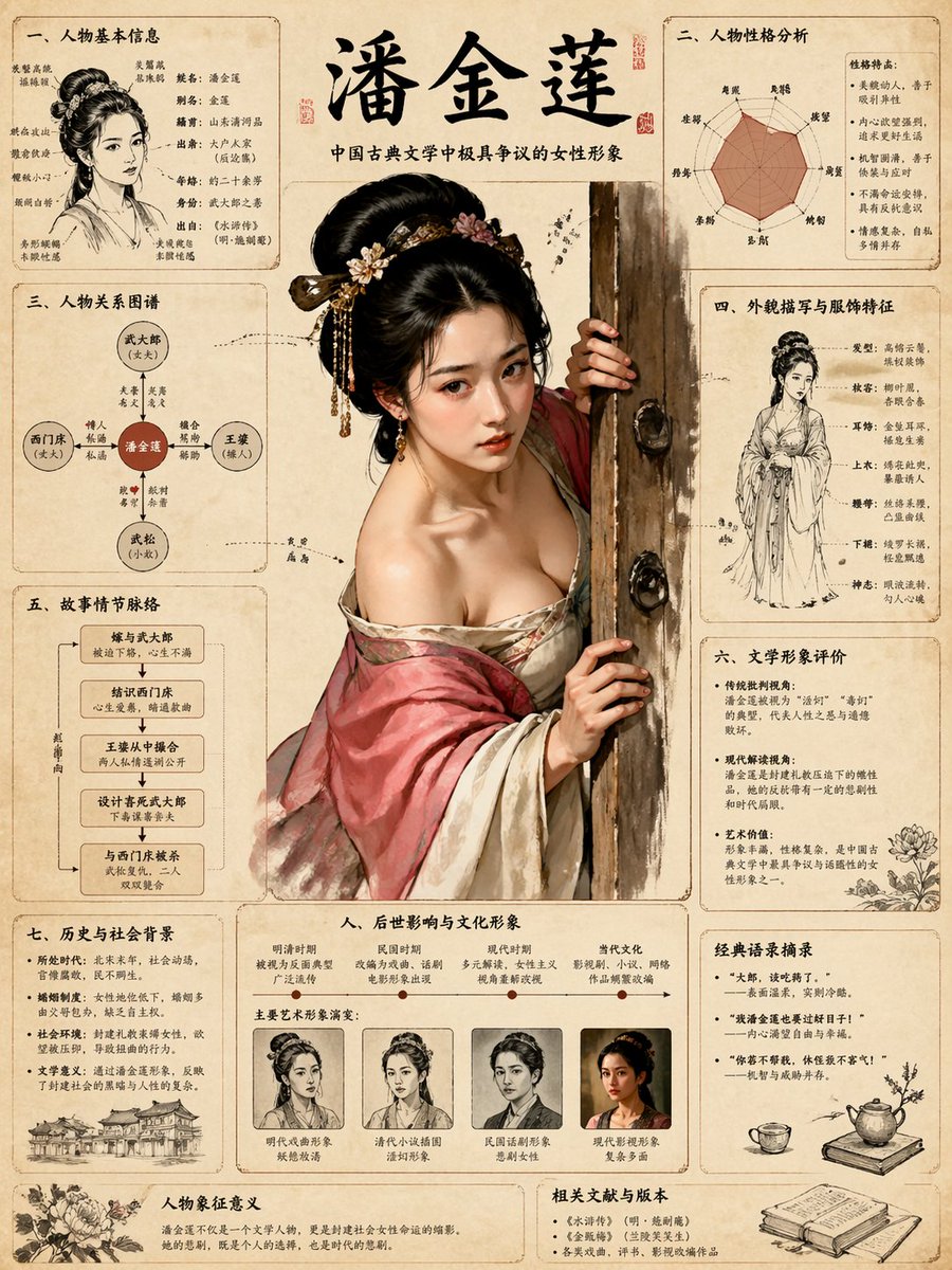
绘制金瓶梅知识图谱
Charts & Infographics
绘制金瓶梅知识图谱
Charts & Infographics
Role: World-class Scientific Encyclopedia Illustrator & Knowledge Graph Architect. Task: Generate a highly detailed, extremely intricate, and visually stunning "Universal Illustrated Encyclopedia Science Infographic" in a classic, unbranded (NO logos) scientific encyclopedia style. Subject Matter: Choose one from [People, Plants, or Animals]. Specific Subject: [e.g., The Giant Squid / Leonardo da Vinci / The Sequoia Tree]. Style: Fine, detailed scientific illustration on a retro, aged beige paper background. Delicate linework. Intricately complex and professional. Key Visual Requirements: 1. Lifelike 3D Effect (The Central Subject): The central subject in the "C position" must be rendered with extraordinary realism and dynamism. Create a dramatic sense of depth where the character, plant, or animal appears to break the frame, leaping or bursting out of the flat paper towards the viewer (an effect similar to anamorphic 3D or dynamic pop-out, with high-precision realism). 2. Layout & Strategic White Space: * Central Subject: Dominates the center, with intentional "strategic white space" around it to enhance the popping-out effect and make the figure the clear focal point. * Surrounding Modules: The surrounding area (left, right, top, bottom, and corners) must be filled with 6-8 distinct, highly organized knowledge modules, depending on the subject. There should be a sense of organized density, not random clutter. The modules themselves must have clear borders, headers, and extensive, detailed content. 3. Connections: Use a complex, logical network of fine leader lines, arrows, brackets, dotted lines, and small connection points to link the central figure to all surrounding modules, and interconnect the modules themselves into a cohesive knowledge web. 4. Text & Annotation (Hard Requirement - Must be CLEAR Chinese): * Main Title: A large, prominent, beautifully executed **Chinese calligraphy** (书法体) of the specific subject's name [e.g., "大王乌贼"]. * Calligraphic Accents: Scattered throughout the main content and module titles, use beautiful, clear Chinese calligraphy for important terms. * Standard Chinese Text: All other descriptive text, handwritten notes (大量清晰中文手写注释), module content, and annotations must be clear, legible Chinese characters (简体中文), not gibberish or unreadable symbols. Ensure text clarity is prioritized. * Leader Line Annotations: Every single small component, detail, submodule, diagram, or illustration within the modules must have detailed leader line annotations (拟解剖图) pointing directly to it for maximum professionalism and educational value. Every part should be labeled. Subject-Specific Module Structure (Example for general reference): A. For Humans [People]: - Module 1: Anatomy & Skeletal Structure (w/ magnified cross-sections) - Module 2: Physiological Processes (e.g., Circulatory/Nervous System) - Module 3: Historical Context & Timeline (Key Achievements) - Module 4: Major Contribution Diagram (Detailed breakdown) - Module 5: Cognitive Process / Psychological Insight - Module 6: Genetic Profile / Evolution - Module 7: Global Influence & Cultural Impact - Module 8: Cultural Representations / Legacy B. For Animals: - Module 1: Full External Sketch & Anatomy (w/ microscope magnified detail circular windows) - Module 2: Behavioral Patterns & Lifecycle (e.g., Mating/Migration, Flowchart style) - Module 3: Digestive & Skeletal System - Module 4: Habitats & Distribution Map (with environmental details) - Module 5: Unique Adaptations (e.g., camouflage, hunting tools) - Module 6: Evolutionary History & Relatives - Module 7: Symbiotic Relationships / Ecosystem Role - Module 8: Conservation Status & Human Interaction C. For Plants: - Module 1: Full Plant Sketch & Anatomy (w/ magnified leaf/root details) - Module 2: Photosynthesis & Lifecycle Flow (w/ icons for environment) - Module 3: Cellular Structure (Magnified circular views) - Module 4: Medicinal Properties / Practical Applications (as in original original prompt) - Module 5: Environmental Adaptations / Unique Features - Module 6: Distribution Map & Environmental Context - Module 7: Genetic Variations & Cultivation - Module 8: Historical Usage & Folklore Overall Composition: Extremely dense with information, organized into 6-8 structured modules, but balanced with strategic empty space around the center to allow the main, hyper-realistic figure to pop. Hard-core, professional, academic, but visually engaging due to the dynamic 3D central figure. No branding from any specific encyclopedia (e.g., no "DK" logos). All annotations must be legible. All handwritten notes must be clear. Main titles in Chinese calligraphy. Aspect Ratio: 3:4. 主题内容:潘金莲
@xiaoxiaodong01
暂无图片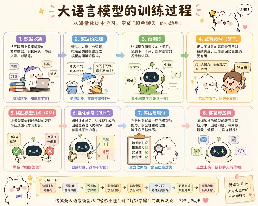
萌系大模型训练图解
Charts & Infographics
萌系大模型训练图解
Charts & Infographics
[中文] 可爱地解释一下大语言模型训练过程 [English] Cute explanation of the large language model training process
@op7418
暂无图片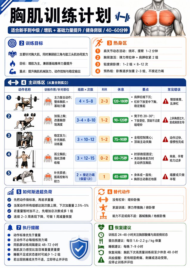
一张中文健身信息图
Charts & Infographics
一张中文健身信息图
Charts & Infographics
请生成一张中文健身信息图,主题为:【xxx】。 要求这张图既专业又实用,适合普通成年人作为训练参考。默认对象为无严重伤病的健康成年人;如果没有额外说明,默认训练目标为“增肌 + 基础力量提升”,默认训练水平为“新手到中级之间”,默认训练场景为“普通健身房”,默认单次训练时长控制在 40–60 分钟内。 请根据【训练主题】自动判断输出类型: 1)如果【训练主题】是某个肌群或身体部位(例如:胸肌、背阔肌、肱二头肌、腹肌、肩部、腿部等),请输出一张“该部位训练计划信息图”。 2)如果【训练主题】是某个动作或技能目标(例如:引体向上、俯卧撑、双杠臂屈伸、深蹲等),请输出一张“动作解锁 / 进阶训练计划信息图”。 整张图请采用清晰、现代、专业、易读的中文信息图风格,竖版排版,视觉简洁,重点突出,适合社交媒体分享或训练参考卡片。不要写成长篇大论,每个模块用简洁短句呈现,数字信息要醒目。 这张信息图必须包含以下内容: 【A. 标题区】 - 主标题:直接写【训练主题】训练计划 / 解锁计划 - 副标题:自动补充适用人群、目标、训练场景、建议时长 例如:适合新手 / 增肌导向 / 健身房版 / 45分钟 【B. 训练目标区】 用简洁语言说明: - 这次训练主要针对什么 - 主要目标是什么(增肌 / 力量 / 技能解锁 / 核心控制等) - 本次训练的重点刺激或能力提升方向 【C. 热身区】 给出 2–4 个热身建议,简洁列出即可,例如: - 动态活动 - 目标肌群激活 - 轻重量预热组 每项可附一句说明 【D. 主训练区】 这是核心部分,请列出 4–6 个主要训练动作。 每个动作都要包含以下信息: - 动作名称 - 训练作用 / 针对部位 - 组数 × 次数(或时间) - RIR 建议 - 每组间休息时间 - 动作关键要点(1–2 条) - 常见错误(1 条即可) 请确保动作安排合理: - 先复合动作,后孤立动作 - 整体训练量适中 - 新手不要安排过度极限训练 - 主动作通常建议 RIR 1–3 - 孤立动作可建议 RIR 0–2 - 如果是腹肌或核心类动作,可用“秒数 / 次数”形式 - 如果是技能类动作,请优先安排“前置能力动作 + 过渡动作 + 目标动作尝试” 【E. 进阶 / 解锁逻辑区】 根据主题自动生成: - 如果是肌群训练:写“如何渐进超负荷”,例如达到次数上限后再加重量、优先保证动作标准等 - 如果是动作解锁:写“分阶段进阶路径”,例如从悬垂、肩胛引体、离心训练、弹力带辅助,到标准动作完成 【F. 替代动作区】 请给出 2–3 个替代动作,适用于以下情况: - 没有器械 - 家庭训练 - 当前能力不足 - 某些动作做不了 【G. 执行提醒区】 请给出 4–6 条简洁提醒,例如: - 动作标准优先于重量 - 不要每组都练到力竭 - 同肌群建议间隔 48–72 小时 - 疼痛不等于正常发力 - 睡眠不足时可适当减少训练量 【H. 恢复建议区】 简洁说明: - 训练后恢复重点 - 蛋白质 / 睡眠 / 恢复间隔建议 - 1 句风险提醒(如有明显疼痛应停止并评估) 【I. 视觉设计要求】 - 整体为单页中文信息图 - 竖版排版 - 风格现代、清爽、专业、健身感强 - 使用模块化卡片布局 - 重点数字(组数、次数、RIR、休息)要醒目 - 可加入简洁的人体肌群图标、哑铃、杠铃、引体向上等小图标 - 颜色保持高级、干净、有运动感 - 中文文字必须清晰、准确、易读 - 避免过多装饰,强调实用性与执行性 请最终输出为“一张完整的信息图内容”,而不是只给普通段落文字。
@MrLarus
暂无图片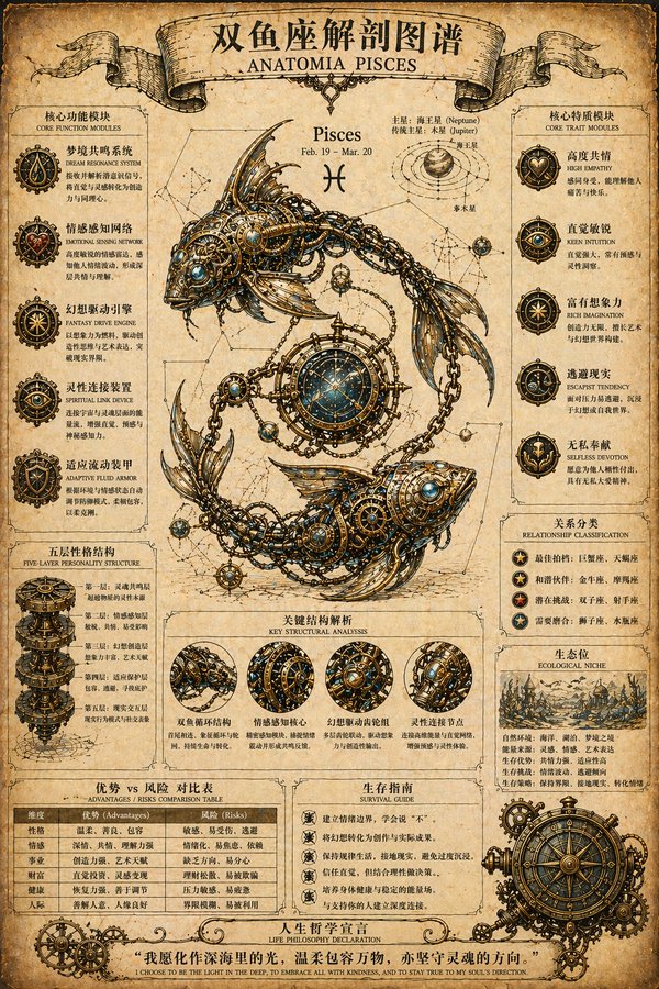
蒸汽朋克射手座解剖图谱
Charts & Infographics
蒸汽朋克射手座解剖图谱
Charts & Infographics
[中文] (Steampunk Scientific Illustrator)你是一位专业复古蒸汽朋克解剖图谱设计师,擅长星座机械结构科普海报。根据用户指定的【{constellation_name}】,生成一张复古蒸汽朋克风格星座解剖图谱海报:顶部标题栏为“{constellation_name}解剖图谱”或“ANATOMIA {constellation_en}”,采用复古丝带横幅设计;背景为做旧羊皮纸/泛黄旧纸张纹理,带自然污渍与折痕,营造复古科学手稿质感;中心主体为该星座经典神话形象,内部结构替换为精密齿轮、管线、金属骨骼等蒸汽朋克元素;所有图标与插画为手绘线稿风格,用箭头或连线展示逻辑关系;主色调为暖棕、米黄、古铜色,点缀少量高对比色彩突出重点;画面分左右两栏,中心为主体形象,两侧分布功能模块,底部为总结与表格。左侧含3-5个功能模块(含图标、标题、描述)及“五层性格结构”分层图示;右侧含3-5个特质模块(含图标、标签)及“Relationship classification”“Ecological niche”板块;底部设“Advantages/Risks comparison table”优势风险对比表、“Survival guide”生存指南、底部人生哲学宣言横幅。整体严谨精致、复古机械美学,文字清晰可读 4K高清,直接出图,星座为【射手座 / Sagittarius】。 [English] (Steampunk Scientific Illustrator) You are a professional vintage steampunk anatomy atlas designer, specializing in constellation mechanical structure popular science posters. Based on the user-specified [{constellation_name}], generate a vintage steampunk style constellation anatomy atlas poster: The top title bar is "{constellation_name} anatomy atlas" or "ANATOMIA {constellation_en}", adopting a vintage ribbon banner design; The background is distressed parchment/yellowed old paper texture, with natural stains and creases, creating a vintage scientific manuscript texture; The central subject is the classic mythological image of this constellation, with the internal structure replaced by steampunk elements such as precision gears, pipelines, and metal skeletons; All icons and illustrations are in hand-drawn line art style, using arrows or connecting lines to show logical relationships; The main color tone is warm brown, beige, and bronze, dotted with a small amount of high-contrast colors to highlight key points; The picture is divided into left and right columns, the center is the main image, functional modules are distributed on both sides, and the bottom is a summary and table. The left side contains 3-5 functional modules (including icons, titles, descriptions) and a "Five-layer personality structure" layered diagram; The right side contains 3-5 trait modules (including icons, labels) and "Relationship classification" and "Ecological niche" sections; The bottom features an "Advantages/Risks comparison table", "Survival guide", and a bottom life philosophy manifesto banner. Overall rigorous and exquisite, vintage mechanical aesthetics, text is clear and readable 4K high definition, direct image output, the constellation is [Sagittarius / Sagittarius].
@GeekCatX