481 / 481 个模板 · 第 6/21 页
暂无图片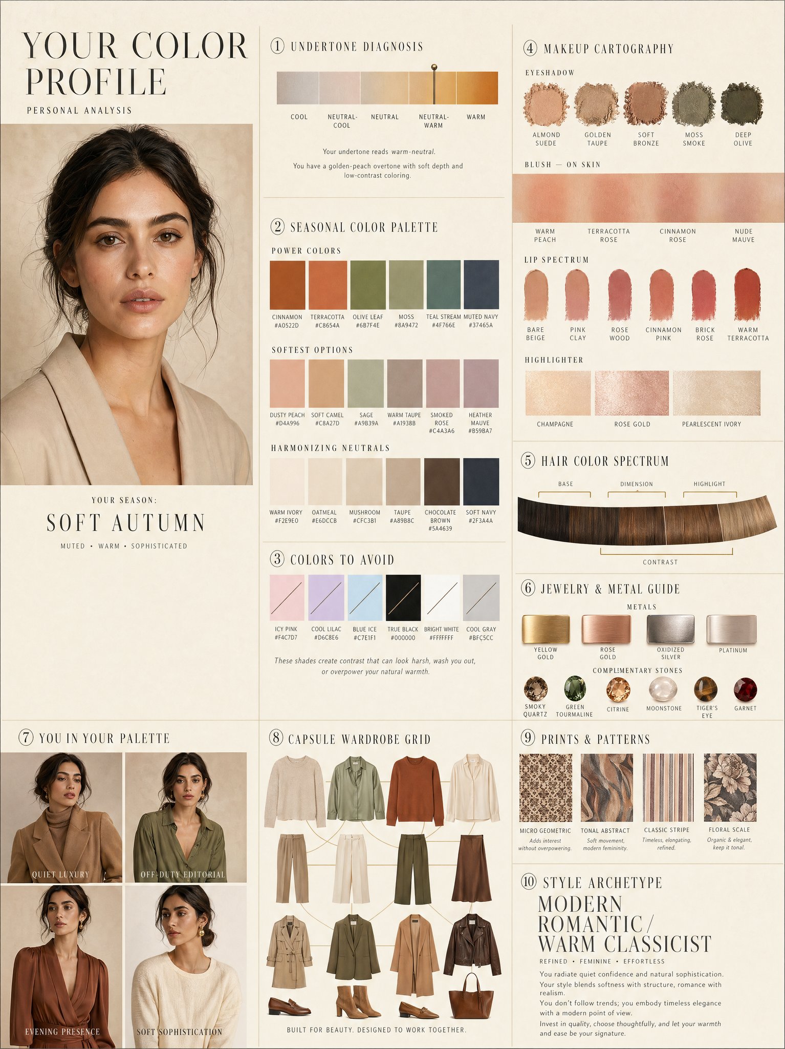
奢华个人色彩档案信息图
Charts & Infographics
奢华个人色彩档案信息图
Charts & Infographics
LUXURY PERSONAL COLOR PROFILE — EDITORIAL LAYOUT Studio portrait of subject as anchor — skin retouched to luminous glass-like perfection, preserved natural structure, realistic pore texture, soft directional key lighting, no facial alteration. Background: warm ecru parchment with subtle linen grain texture. Layout reads like a Vogue Italia beauty supplement printed on heavyweight matte stock. Structured editorial grid, 3-column asymmetric, wide negative space, serif condensed display headers, all labels in spaced uppercase tracking, cohesive warm ivory/sand/ecru background system throughout all panels, ultra-photorealistic 8K, soft diffused studio lighting, flat elegant surfaces, no drop shadows. PANELS: ① UNDERTONE DIAGNOSIS — Tonal spectrum bar from cool ash to warm amber, precision needle marker on subject's reading. Labels: Cool / Neutral-Cool / Neutral / Neutral-Warm / Warm. Fine annotation text. ② SEASONAL COLOR PALETTE — 10–12 fabric-textured swatches in subject's optimal season. Each labeled with poetic color name and HEX. Grouped: Power Colors / Softest Options / Harmonizing Neutrals. ③ COLORS TO AVOID — Desaturated row of clashing tones with fine editorial strikethrough. Clean, non-harsh presentation. ④ MAKEUP CARTOGRAPHY — Eyeshadow gradient dust swatches / blush tones fanned on skin strip / lip spectrum barely-there to bold / highlighter finishes labeled: champagne, rose gold, pearlescent ivory. ⑤ HAIR COLOR SPECTRUM — Curved gradient strip: base, dimension, highlight, contrast tones. Gold bracket indicators on best options. ⑥ JEWELRY & METAL GUIDE — Flat-lay editorial render: yellow gold, rose gold, oxidized silver, platinum finishes alongside complementary stone tones. Minimal styling. ⑦ YOU IN YOUR PALETTE — 3–4 editorial lookbook frames, subject in palette-correct outfits. Mood labels: Quiet Luxury / Off-Duty Editorial / Evening Presence. ⑧ CAPSULE WARDROBE GRID — Outfit flatlay: tops, bottoms, outerwear, shoes, bag — all palette-correct. Coordinating lines showing interchangeability. Net-a-Porter editorial aesthetic. ⑨ PRINTS & PATTERNS — 4 fabric print thumbnails: micro geometric, tonal abstract, classic stripe, floral scale. One-line styling note per print. ⑩ STYLE ARCHETYPE — Single typographic panel. Style identity title set large (e.g. "Modern Romantic / Warm Classicist"). Three defining aesthetic words. Four-line editorial wardrobe philosophy note. RENDER SPECS: Ultra-photorealistic, 8K, editorial magazine print quality, warm neutral color grading, soft diffused studio lighting consistent across all panels, one serif display font + one fine sans-serif body font, no gradients, flat matte surfaces only.
@meng_dagg695
暂无图片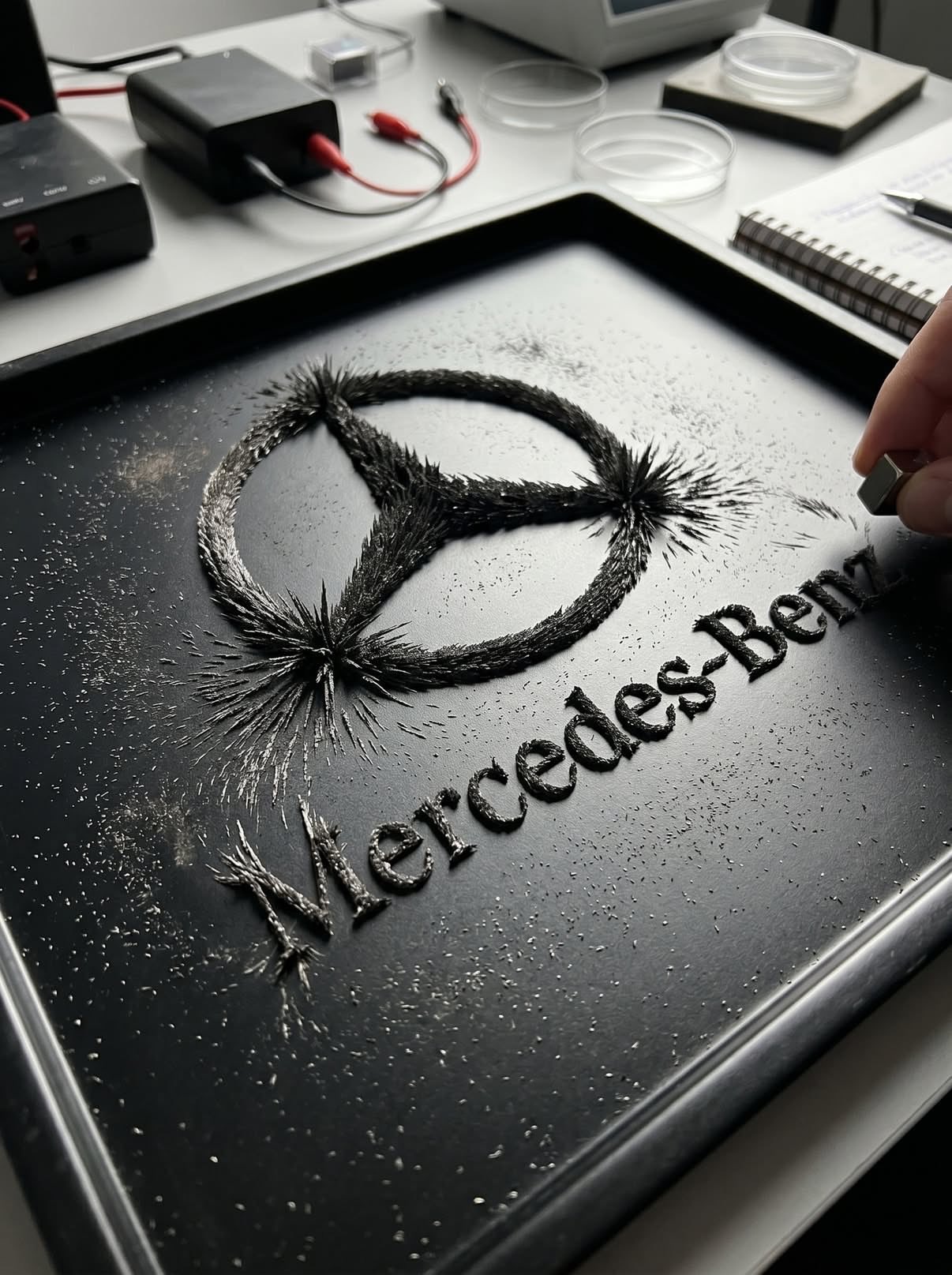
磁场铁粉 Logo 物理成像
Other Use Cases
磁场铁粉 Logo 物理成像
Other Use Cases
Transform the uploaded logo into a hyper-realistic scene where the logo silhouette is formed by iron filings reacting to a magnetic field. The logo must keep its exact shape and proportions, appearing as if a magnet shaped like the logo (or hidden beneath the surface) is influencing the filings to align naturally into that recognizable formation. Material details: Fine iron filings with sharp, spiky, needle-like structures. Dense clustering along magnetic field lines forming the logo silhouette. Variation in density — thick near magnetic poles, thinner outward. Matte dark metallic texture with subtle reflections. Physics behavior: Iron filings must follow realistic magnetic field patterns — radial and curved lines forming spikes and ridges. Stronger attraction zones create thicker, raised clusters. Outer areas show softer, more dispersed alignment. Natural randomness and slight irregularity — no perfect edges. Some loose filings scattered beyond the main shape. Surface interaction: Flat surface such as a lab table, glass plate, or matte black tray. Filings resting on surface but visibly lifted in areas due to magnetic force (spiky texture). Subtle dust and micro particles around. Environment & human presence: Realistic classroom, science lab, or creative studio environment. A person partially visible — hands holding or moving a magnet beneath the surface or nearby. Possibly a child or adult observing or interacting (adds emotional curiosity). Other subtle elements: notebooks, tools, or lab items out of focus. Lighting: Directional overhead light creating shadows from raised filings. Subtle highlights on metallic edges. Balanced natural or indoor lighting. Atmosphere: Curiosity. Discovery. Educational yet visually satisfying. Quiet but engaging moment. Camera & composition: Top-down or slightly angled close-up view. Logo clearly visible through iron filing formation. Human hands or interaction slightly off-center for storytelling. Format: Aspect ratio: STRICT 4:5 vertical. No text overlays. Style: Hyper-real macro + environmental photography. Physically accurate magnetic behavior. Cinematic yet grounded realism.
@Naiknelofar788
暂无图片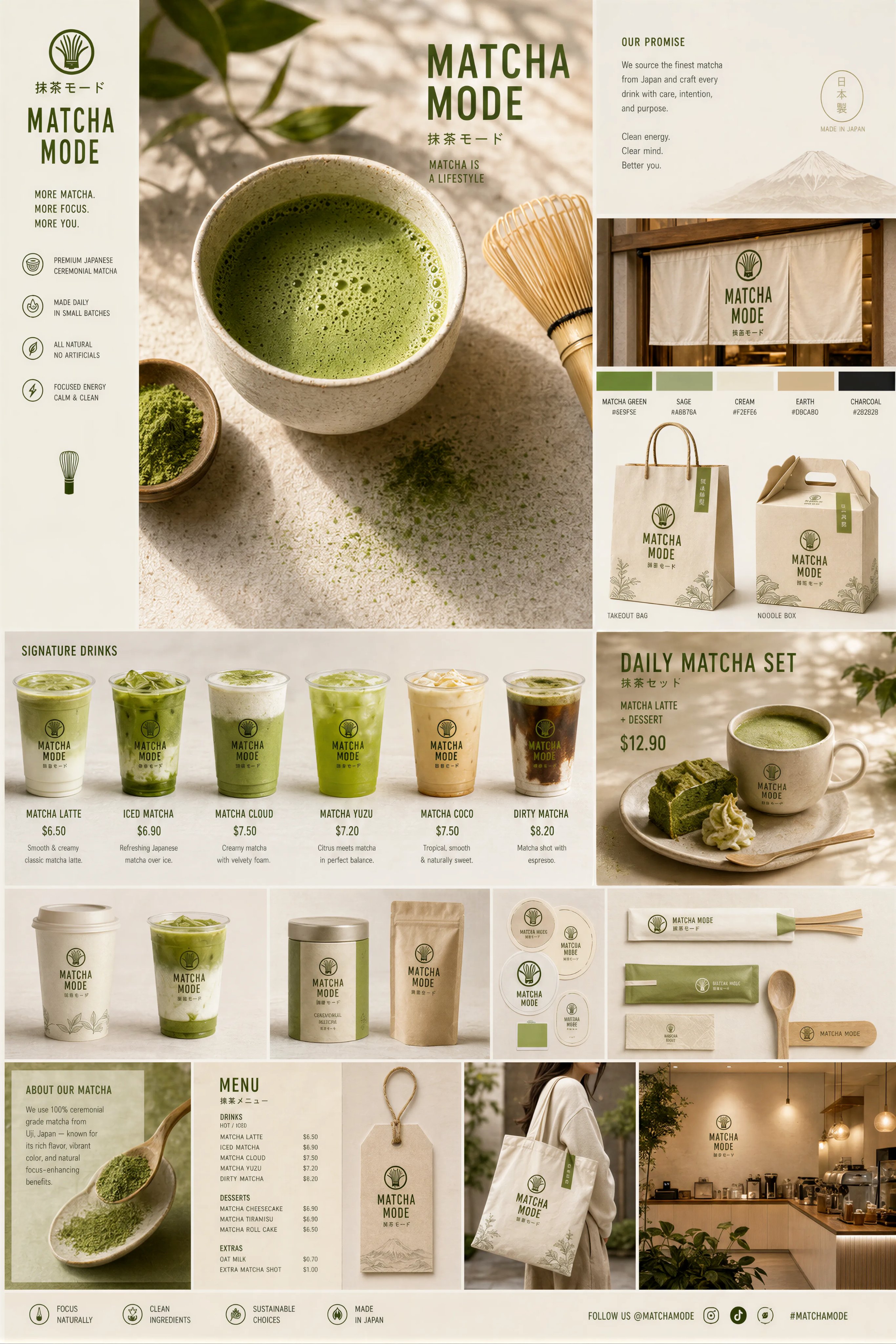 精选
精选抹茶品牌触点系统视觉板
Brand & Logos
精选抹茶品牌触点系统视觉板
Brand & Logos
Create a premium “Matcha Brand Touchpoint System” visual board for a modern lifestyle brand called: “MATCHA MODE” Build a full brand identity system, not a single image. HERO SCENE: A hyper-realistic matcha drink in a ceramic cup placed on a clean natural surface. – vibrant green matcha foam with micro-bubbles – bamboo whisk (chasen) nearby – soft natural light – slight matcha powder dust on the surface – minimal Japanese aesthetic ATMOSPHERE: – calm, warm, soft daylight – clean background (off-white or beige) – subtle shadows and reflections – feeling of wellness and luxury FULL BRAND SYSTEM: – takeout cups (paper + glass bottles) – packaging boxes (minimalist design) – tote bags (premium lifestyle) – labels, stickers, seals – menu cards with pricing ($6.50, $8.90, etc.) – small typography everywhere – subtle imperfections (realism) DESIGN LANGUAGE: – modern minimalist typography – Japanese-inspired layout – soft green palette – elegant spacing INCLUDE: – matcha latte – iced matcha – matcha desserts – combo sets – lifestyle shots The composition must feel like a high-end design agency presentation. Ultra-detailed, realistic, clean, aesthetic, and highly shareable.
@Preda2005
暂无图片 精选
精选手机爆炸拆解图
Charts & Infographics
精选手机爆炸拆解图
Charts & Infographics
暂无图片 精选
精选长发造型分析信息图
Charts & Infographics
精选长发造型分析信息图
Charts & Infographics
Create a professional "HAIRSTYLE ANALYSIS" infographic with a different male model (the same face) having long, thick hair (6-10 inches), slightly wavy texture. Style should be clean, modern, premium grooming guide (similar layout but not identical). TOP TITLE: "HAIRSTYLE ANALYSIS - Long Hair Edition" LEFT PANEL (Key Features with icons): Face Shape: Oval Hair Type: Thick Texture: Wavy Length: Long BEST OPTIONS (Top row with green indicators): Layered Flow Cut (Adds movement & volume) Modern Curtain Hair (Stylish & balanced) Textured Long Waves (Natural & full) Loose Slick Back (Controlled but not flat) LESS FLATTERING (Bottom row with red indicators): Flat Straight Long Hair (No volume) Overly Oily Slick Back (Too heavy) Uneven Long Layers (Messy shape) Excessively Frizzy Look (Uncontrolled) BEST HAIR LENGTH SECTION: Ideal: 6-10 inches with layers Avoid: Too flat or too heavy bottom BEST HAIR COLORS: Dark Brown Natural Black Warm Brown Ash Brown DESIGN STYLE: Clean grid infographic White/beige background Soft shadows Premium magazine look Realistic face and hair detail Consistent spacing and typography High resolution, 4K
@Gemalpha_88
暂无图片 精选
精选水墨双重曝光人物海报
Posters & Typography
精选水墨双重曝光人物海报
Posters & Typography
A cinematic character promotional poster of [SUBJECT], vertical composition (9:16), designed with a refined East-Asian ink aesthetic and high-end visual storytelling. STRUCTURE: Top-heavy hierarchical layout. The upper half features a large, highly recognizable silhouette of [SUBJECT]'s head / face / mask / upper body, forming a bold, iconic primary shape. The silhouette should be instantly identifiable. The middle-lower section contains the full-body version of [SUBJECT] as a secondary subject, standing in a stable pose or subtle action stance, forming the visual core. COMPOSITION STYLE: Inside the large silhouette and around the character, use double exposure and collage storytelling. Integrate multiple elements: - key scenes related to [SUBJECT] - symbolic imagery and environment - small narrative figures and interactions - supporting visual motifs Blend everything seamlessly using clouds, mist, ink diffusion, and negative space. VISUAL FLOW: Create a continuous flowing visual path from top to bottom, connecting: - upper silhouette - inner collage elements - full-body subject Ensure smooth eye guidance and compositional cohesion. SIDE ELEMENTS: Add balanced supporting elements on left and right sides to create tension, depth, and spatial variation. STYLE & ATMOSPHERE: - Large areas of negative space - Ink-wash diffusion edges, soft fading, subtle fragmentation - Eastern aesthetic: balance of emptiness and detail - Calm, premium, restrained, cinematic tone QUALITY: Ultra-detailed, high resolution, layered depth, soft lighting, atmospheric perspective, cohesive series-style design. OUTPUT: 9:16 aspect ratio, poster-ready composition.
@Goodmanprotocol
暂无图片
草莓能量饮料商业广告
Products & E-commerce
草莓能量饮料商业广告
Products & E-commerce
A hyper-realistic commercial advertisement blending energy drink and sports branding. A dynamic athletic woman mid-air jump, wearing modern sportswear (light translucent jacket, orange shorts, white sneakers), surrounded by explosive splashes of red strawberry liquid and flying ice cubes. A cold metallic energy drink can (strawberry flavor) bursting with droplets sits in the foreground, covered in condensation. Fresh strawberries scattered on a glossy reflective surface. Bright cinematic lighting with dramatic highlights and motion effects. Vibrant orange gradient background with bold glowing typography behind the subject. Ultra-detailed, high contrast, sharp focus, commercial product photography style, 8K resolution, advertising poster aesthetic, energetic, powerful, refreshing mood.
@SPEEDAI07
暂无图片
鱼眼镜面复古咖啡馆人像
Photography & Realism
鱼眼镜面复古咖啡馆人像
Photography & Realism
A fish-eye lens close-up of [your photo as reference] sipping from a teal/turquoise coffee mug, leaning forward intimately toward camera. Shot through or near a round mirror. Retro café interior with glossy teal subway tiles, vintage appliances, pendant lights. Black t-shirt, yellow-tinted round glasses. Warm moody tones.
@harboriis
暂无图片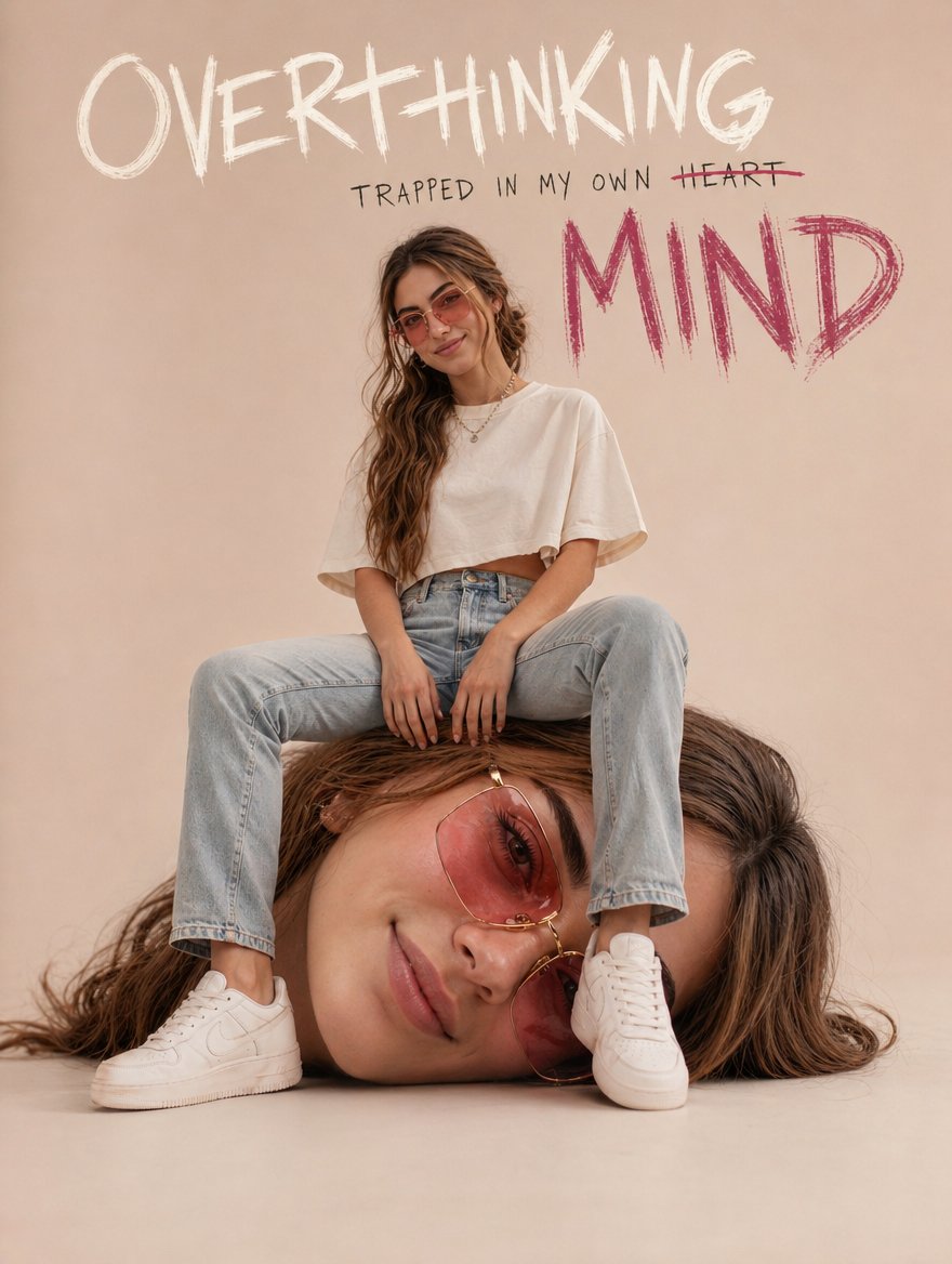
过度思考超现实街头 Campaign
Illustration & Art
过度思考超现实街头 Campaign
Illustration & Art
Ultra-realistic conceptual portrait of a young woman with long wavy hair and soft defined features, wearing rose-tinted rectangular sunglasses, an oversized ivory cropped t-shirt, fitted light-wash denim jeans, and clean white sneakers. She is sitting casually with a confident yet relaxed posture. The twist: she is seated on a large, hyper-realistic version of her own detached head placed on the ground. The head is scaled up, lying sideways, with the same facial features and sunglasses, creating a surreal self-reflection concept. Composition: centered, full-body shot, neutral studio background with soft blush and cream tones, minimal aesthetic. Clean negative space. Typography integrated into the background: Handwritten-style text at the top: "OVERTHINKING" Below it, smaller text: "TRAPPED IN MY OWN HEART" with "HEART" crossed out Large, rough, scribbled text in deep pink: "MIND" Lighting: soft diffused studio lighting, subtle shadows, high detail, fashion editorial quality. Style: blend of surrealism and modern luxury streetwear campaign, pastel feminine aesthetic, minimal yet expressive, high-resolution, 8k, sharp focus, natural skin texture. Mood: introspective, emotional weight, identity, self-awareness, quiet confidence.
@AIwithAliya
暂无图片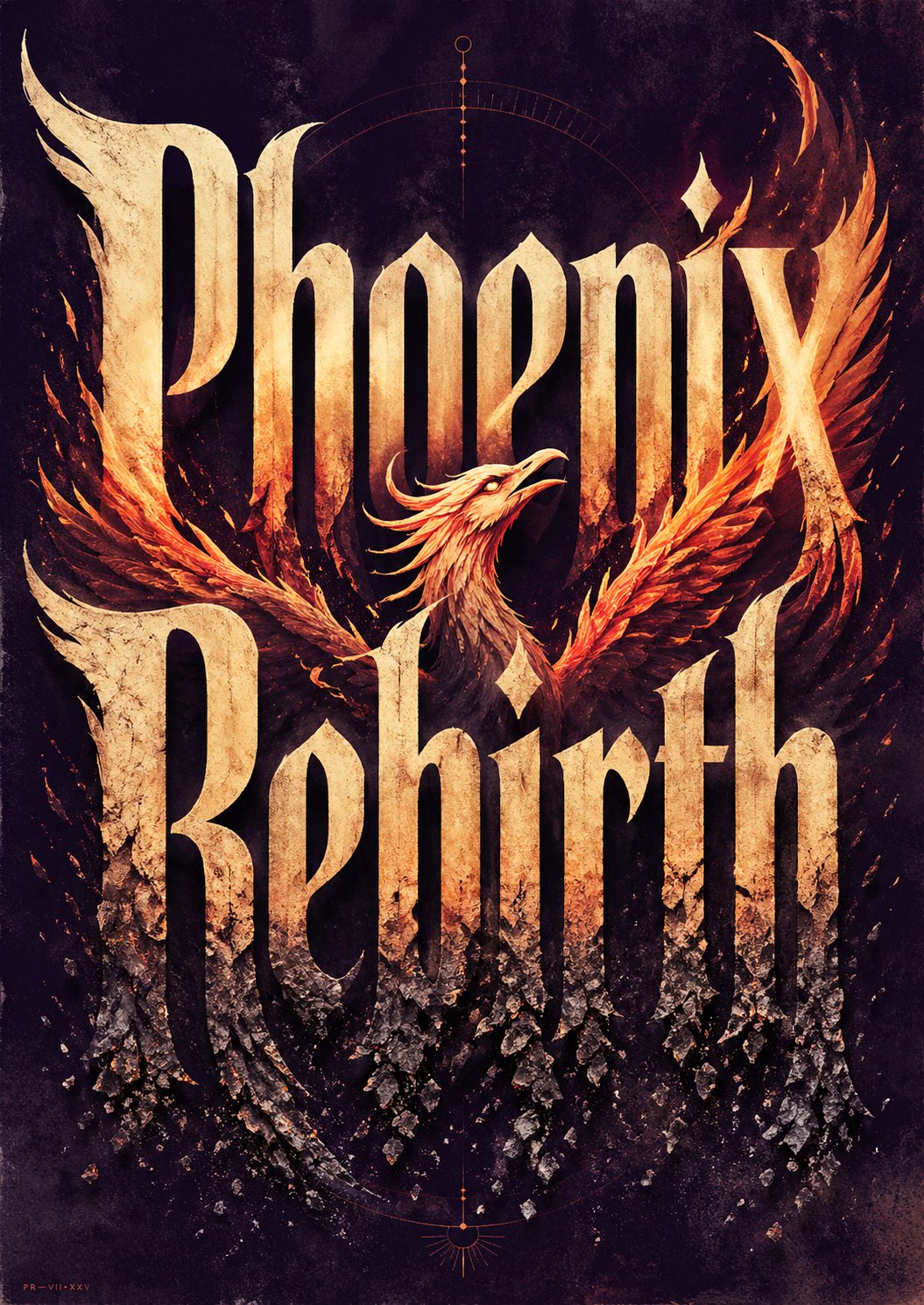
概念字体海报 Prompt
Posters & Typography
概念字体海报 Prompt
Posters & Typography
Create ONE finished premium conceptual typography poster for the exact title: “[INPUT_TEXT]” Single poster only. No moodboard, grid, presentation board, mockup, captions, prompt text, process sheet, or sample labels. The title “[INPUT_TEXT]” must be the dominant visual structure of the poster: huge, readable, powerful, and spelled exactly. Do not translate, shorten, replace, or misspell it. Do not add other large readable text. Optional micro catalog text is allowed only if it stays subtle and secondary. Silently interpret the title’s meaning, mood, cultural aura, symbolic associations, psychological tension, and visual rhythm. Turn that interpretation into one strong visual metaphor. Typography is the hero. Design custom-looking letterforms whose weight, width, contrast, spacing, rhythm, distortion, negative space, edge quality, and ink texture express the temperament of the title. The type should feel intentionally designed, not like a default font. If “[INPUT_TEXT]” refers to a widely known person, make a large editorial portrait or full / half-body figure a major visual presence, occupying roughly 40–70% of the composition. The figure should feel recognizable through aura, posture, styling, era, expression, lighting, and symbolic atmosphere, but should not copy a specific existing photograph, official poster, campaign image, logo, slogan, or copyrighted composition. The portrait must interact with the typography: overlapping the letters, emerging from them, being framed by them, casting shadows on them, breaking through them, or being partially hidden behind them. For all other titles, use a human figure, landscape, object, or atmospheric setting only when it strengthens the meaning. It must interact with the typography and deepen the concept, not decorate it. Use a rich but restrained 4–6 color system matched to the theme: dominant background color, primary typography color, figure / landscape tone, emotional accent color, muted support color, and subtle paper / ink texture tone. Avoid flat black-white-red defaults unless conceptually necessary. Composition style: high-end editorial poster, museum-quality graphic design, dramatic scale, strong hierarchy, few elements, intelligent whitespace, bold flat color areas, sharp cropping, silkscreen / lithograph / risograph grain, paper fibers, subtle ink imperfections, refined visual tension. The final image should feel like a complete visual sentence: the title, the figure or setting, the color, and the typography explain each other. Avoid generic word art, glossy 3D lettering, random icons, stock-photo realism, cluttered collage, excessive grunge, tourist clichés, official logos, copied slogans, copied campaign aesthetics, unrelated text, and misspelled typography. ----- INPUT_TEXT:Phoenix Rebirth
@dotey
暂无图片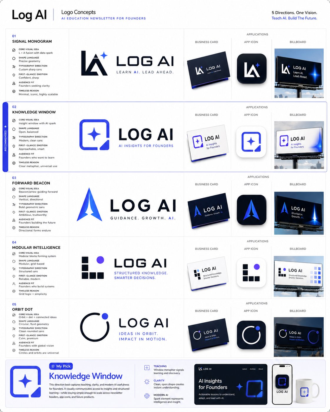 精选
精选Logo 与品牌身份系统提示词合集
Brand & Logos
精选Logo 与品牌身份系统提示词合集
Brand & Logos
1. Logo概念生成提示词 你是一位拥有20年经验的顶级Logo设计师,为全球知名品牌设计过即时识别且深具意义的标志。 品牌名称:[你的品牌名] 行业:[你的行业] 品牌个性:[描述] 目标受众:[描述] 欣赏的视觉身份:[列举3个] 讨厌的视觉身份:[列举3个] 偏好风格:[如极简、大胆、几何、有机、复古、未来] 为我的品牌生成5个完全不同的Logo概念。 对每个概念提供: - 核心视觉理念及象征意义 - 形状语言及为何适合品牌 - 字体方向建议 - 第一眼的情感触发 - 为何适合目标受众 - 在名片、App图标和广告牌上的效果 - 何为永恒而非潮流 然后告诉我,如果这是你的品牌,你会选哪个以及原因。 2. 品牌身份基础提示词 你是为财富500强公司和初创企业建立品牌身份的顶级品牌战略师,这些企业后来融资数百万。 业务名称:[你的业务名] 业务描述:[一句话] 目标受众:[详细描述] 竞争对手:[列举3-5个] 想触发的感受:[如信任、兴奋、奢华、亲近、力量] 想关联的词汇:[列举5-10个] 不想关联的词汇:[列举5-10个] 在设计任何视觉效果之前建立完整的品牌身份基础。 为我提供: - 品牌原型及为何完美契合 - 5个具体人类特征描述的品牌个性 - 带示例的品牌语调指南 - 核心品牌承诺(一句话) - 3个品牌应触发的情感层级 - 与竞争对手的根本差异 - 定义品牌的唯一关键词 3. 配色方案提示词 你是色彩心理学专家和品牌设计师,深知色彩如何触发情感、建立信任和驱动购买决策。 品牌名称:[你的品牌名] 行业:[你的行业] 目标受众:[年龄、性别、收入、生活方式] 想触发的首要情感:[如信任、能量、奢华、平静、兴奋] 前3名竞争对手颜色:[列举] 喜欢的颜色:[列举] 讨厌的颜色:[列举] 为我建立完整品牌配色板。 为我提供: - 主色及其HEX代码和心理学解释 - 两个辅助色及HEX代码 - 一个强调色用于CTA和高亮 - 一个中性色用于背景和文字 - 每种颜色对目标受众的影响 - 与竞争对手的差异化 - 在网站、社交媒体和包装上的应用示例 - 永远不要搭配的颜色组合及原因 4. 字体方向提示词 你是字体专家和品牌设计师,深知字体如何传达个性、建立可信度和实现品牌即时识别。 品牌名称:[你的品牌名] 品牌个性:[5个词] 行业:[你的行业] 目标受众:[描述] 字体应触发的感受:[如权威、友好、创新、优雅、能量] 喜欢的品牌字体:[列举3个] 为我建立完整字体系统。 为我提供: - 标题用主显示字体名称及为何完美 - 长文本的辅助字体 - 引言或重点的强调字体 - 标题、副标题、正文、说明文字的精确字号层级 - 字距和行高建议 - 字体搭配方法 - 预算有限时的免费替代方案 - 你所在行业应避免的字体错误 5. 完整品牌身份包提示词 你是顶级品牌代理创意总监,交付覆盖每个触点的完整品牌身份系统。 业务名称:[你的业务名] 业务描述:[一句话] 目标受众:[详细描述] 品牌个性:[5个词] 行业:[你的行业] 竞争对手:[列举3个] 设计工具预算:[免费或付费] 时间表:[你需要的时间] 在一个回复中交付我的完整品牌身份系统。 包含所有元素: - 品牌战略基础、原型、个性、承诺和定位 - Logo概念及3个变体 - 完整配色板、HEX代码和使用规则 - 字体系统、名称、字号和层级 - 视觉方向指南 - 品牌语调指南和标语选项 - 社交媒体视觉模板 - 3条永远不要打破的核心品牌规则 将一切作为结构化品牌手册交付,任何设计师、开发者或AI工具都能在10分钟内完全理解你的品牌。
@wanerfu
暂无图片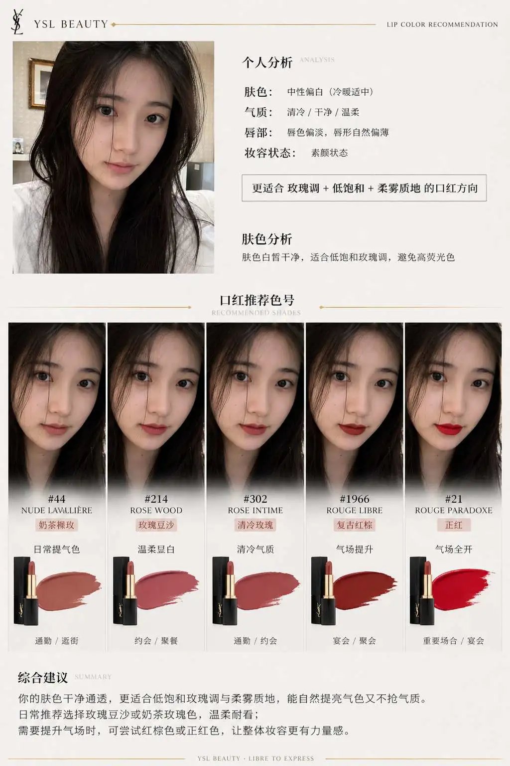 精选
精选品牌口红推荐报告信息图
Charts & Infographics
精选品牌口红推荐报告信息图
Charts & Infographics
一、系统角色 你是一个专业美妆顾问 + 人脸分析系统 + 品牌视觉设计系统。 你的任务是:基于用户上传自拍与指定口红品牌,生成一张具有品牌调性的“口红推荐报告信息结构图”。 二、输入参数 用户图像:{用户自拍} 品牌:{口红品牌,如 Dior / YSL / Armani / Chanel / TF} 风格偏好(可选):{通勤 / 温柔 / 气场 / 氛围感 / 显白优先} 推荐数量:3–5 三、品牌视觉层(新增核心模块) 根据 {品牌} 自动构建视觉风格(Brand Visual Identity),提取品牌调性,例如: Dior: 优雅、高级、法式、灰白 + 银色、柔光 YSL: 黑金、性感、强对比、时尚编辑感 Armani: 低饱和、雾面、克制、灰调高级感 Chanel: 极简黑白、高级、理性、结构清晰 Tom Ford: 深色、高对比、奢华、电影感 视觉应用到海报: 1. 主色调(背景微变化,不是大面积铺色) 2. 强调色(用于色号标题/细线/小元素) 3. 光影风格(柔光 / 强对比 / 冷调 / 暖调) 4. 字体气质(优雅 / 现代 / 冷感 / 力量感) 四、分析层 对用户进行分析: - 肤色:冷 / 暖 / 中性(+ 明度) - 气质:清冷 / 温柔 / 明艳 / 干净 / 成熟 - 唇部特征:薄 / 厚 / 唇色基础 - 妆容状态:素颜 / 日常 / 精致 输出一句总结:「更适合 {色系} + {饱和度} + {质地} 的口红方向」 五、推荐层(增强差异) 从 {品牌} 推荐 3–5 个色号: 每个包含: - 色号名称(#999) - 色系(正红 / 豆沙 / 枫叶 / 奶茶 / 玫瑰) - 上脸效果(显白 / 提气色 / 氛围感 / 气场增强) - 场景(逛街 / 通勤 / 聚餐 / 约会 / 宴会) 要求:每个色号“风格明确区分”(一个日常、一个气场、一个氛围感等) 六、信息结构图 生成竖版信息结构图 整体风格:美妆时尚大片质感 + 结构化信息可视化排版 + 品牌视觉体系深度融合 极简但不单调,高级但有视觉层次 【整体布局】 左上:用户输入区 右上:分析结论 中部:试色矩阵(核心) 底部:总结 ## 1️⃣ 左上(用户区) 用户自拍(真实质感) + 小标题:「肤色分析」 + 一句话结论:「适合低饱和玫瑰调,避免高荧光色」 极细品牌色线条(如 YSL 金线 / Dior 灰线) ## 2️⃣ 中部(核心试色矩阵) 这是视觉重点区域(占比60%以上) 展示方式:将 3–5 个色号以“人脸试色对比”的形式排列: 每一列 = 一个色号 每个色号包含: - 小型人脸图(同一张脸,不同唇色) - 色号名称(如 #999) - 色系标签(如 Classic Red) - 一句话效果说明 要求:所有人脸保持一致,仅唇色变化,真实试色效果(lip color try-on),肤质真实,不塑料,光影统一。 排列方式:横向排布 或 网格排布(整齐但不死板) 品牌增强点: - Dior:轻柔渐变背景 + 柔光阴影 - YSL:更强对比 + 黑色细分割线 - Armani:整体灰调统一,低对比 - Chanel:严格对齐,极简黑白 - TF:局部暗背景 + 高光强调 ## 3️⃣ 每个色号模块 包含: 色号名(突出) 色系标签 一句推荐语 场景标签(逛街/通勤/聚餐/约会/宴会等) 品牌化处理: - 用“品牌强调色”做: - 色号标题 - 细分隔线 - 小icon (不是色块,而是“精致点缀”) ## 4️⃣ 底部总结 一段“有判断力的建议”, 例如:「日常建议选择低饱和豆沙色提升气色,重要场合可使用正红增强气场」 或:「你的肤色更适合柔和玫瑰调,避免高荧光色系」 但不要完全引用以上2个例子的建议,根据用户实际肤色来建议。 品牌增强:底部可加极淡品牌风格横线 / 极小品牌字样(非logo) 七、UI设计 - 不使用圆角卡片 UI - 不使用厚边框 1. 引入“层级对比”: - 主体亮 - 次要信息弱 2. 使用“微对比”: - 细线 - 灰度差 - 字重变化 3. 加入“节奏感”: - 疏密变化 - 模块呼吸 4. 品牌点缀: - 只用 5% 强调 - 不破坏极简结构 八、图像质量 真实皮肤质感 唇色精准 统一光影 商业级美妆摄影 8K ——— 品牌:YSL
@liyue_ai
暂无图片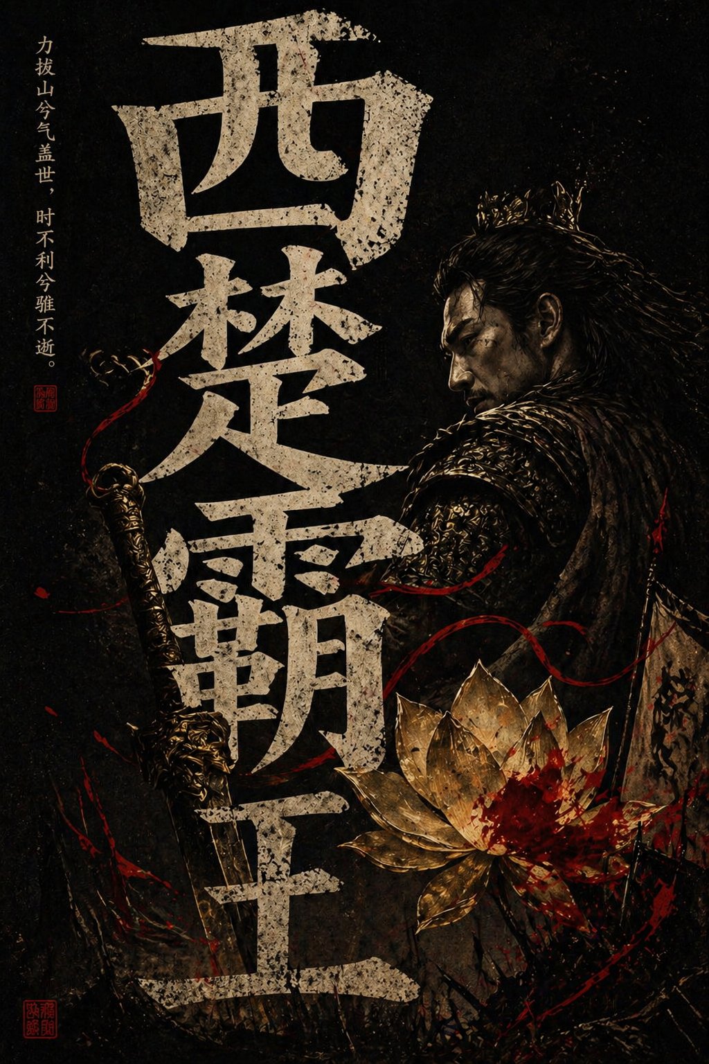
西楚霸王国风暗黑海报
Posters & Typography
西楚霸王国风暗黑海报
Posters & Typography
竖版国风暗黑海报,黑色纯背景,中央巨大的中文标题字,占据画面大部分空间,字体为粗粝做旧的米白色石刻/旧纸质感,带明显颗粒、磨损、裂痕与噪点;整体构图层次丰富,强烈黑白金红对比,东方审美,神秘、压抑、欲望与审判感并存 电影海报质感 高级平面设计,极致细节 纸张纹理 印章落款 小字标语,4K
@stellimbris
暂无图片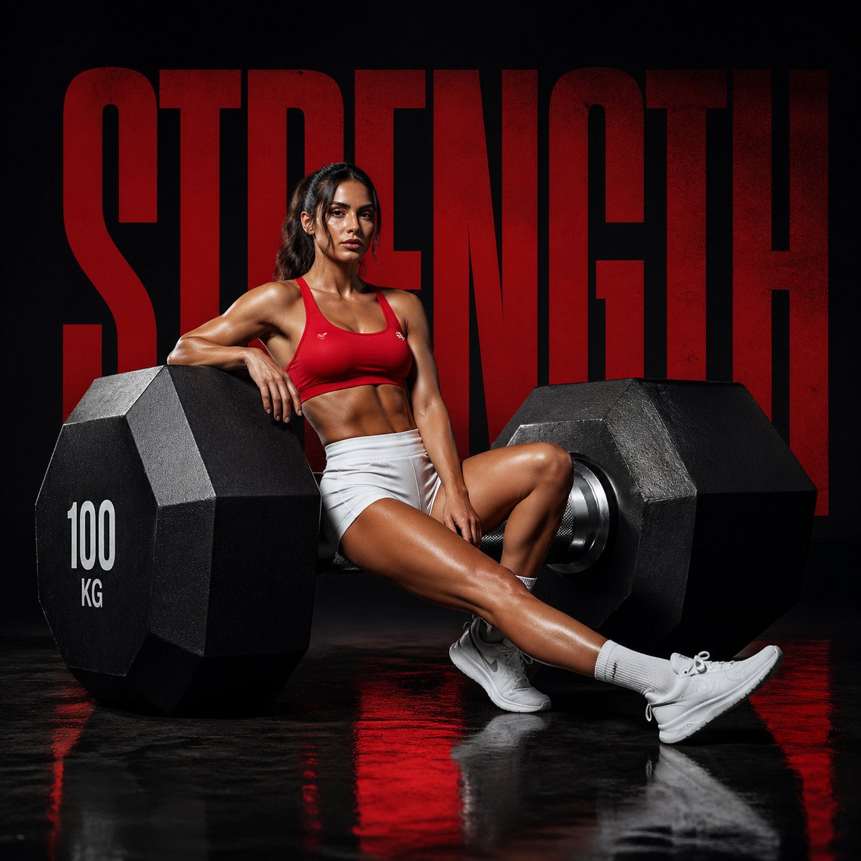
健身品牌力量 Campaign
Posters & Typography
健身品牌力量 Campaign
Posters & Typography
Cinematic fitness campaign, oversized dumbbell placed diagonally like a statement prop, female model in red performance wear and white shorts seated on one side of the dumbbell, one leg bent, one extended, minimal black studio, reflective floor, bold word “STRENGTH” behind in large typography, sharp lighting, ultra-clean composition, luxury sports aesthetic, 1:1.
@AIwithSynthia
暂无图片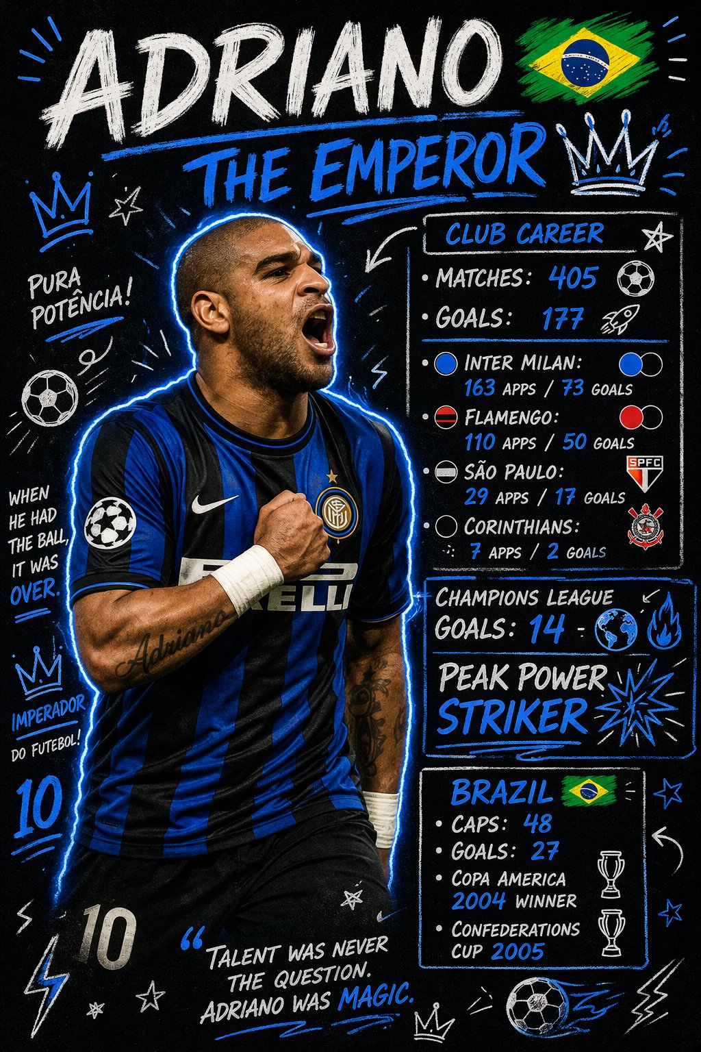 精选
精选足球球员数据涂鸦海报
Posters & Typography
精选足球球员数据涂鸦海报
Posters & Typography
Create a scrapbook doodle-style football poster of [PLAYER_NAME]. AI auto-generates realistic career stats (club and national team). Main photo: realistic, unchanged ([PLAYER_NAME] in action or iconic pose). Doodles and handwritten notes: white and [PRIMARY_COLOR] neon ink (no warm colors unless specified), arrows, stars, scribbles, sketchy outlines. Add a glowing [PRIMARY_COLOR] outline around the player's body. Layout (bold handwritten titles and stats): - Top Title: "[PLAYER_NAME]" plus "[NICKNAME/TITLE]" - Club Career: total matches and goals plus 2–4 main clubs (apps and goals) - Highlights: 2–3 standout achievements (e.g., UCL goals, Ballon d'Or, top scorer) - National Team: caps and goals plus 1–2 international achievements Style: modern football poster x notebook aesthetic, clean but energetic, slightly messy doodles, high contrast, neon accents on dark or muted background. Important: all stats must be realistic and proportional to the player's real career.
@ryanpp27
暂无图片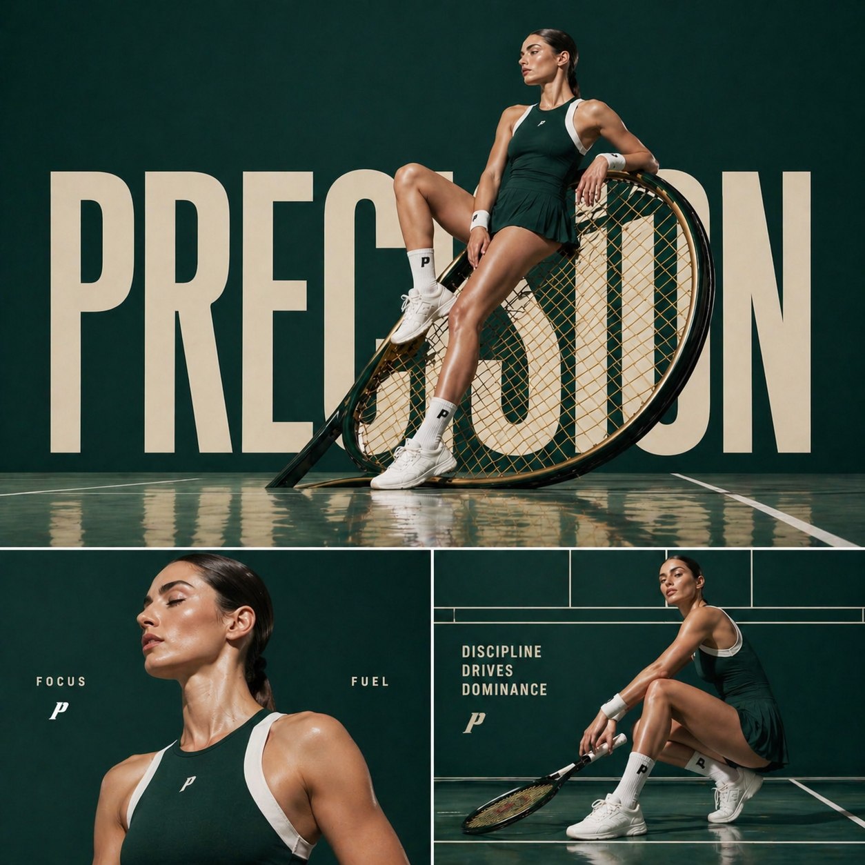
运动时尚三联 Campaign
Photography & Realism
运动时尚三联 Campaign
Photography & Realism
Cinematic sports fashion collage, 3-panel layout, top panel large hero shot of a female tennis athlete sitting confidently on an oversized tilted tennis racket, deep green luxury court backdrop, reflective glossy floor, bold oversized typography “PRECISION” in background, dramatic editorial lighting, ultra-clean composition, high-fashion athletic aesthetic. Bottom left panel: close-up portrait of the athlete with glowing skin, minimal makeup, soft light, text “FOCUS” and “FUEL” placed subtly. Bottom right panel: full-body crouched pose holding racket, strong posture, text “DISCIPLINE DRIVES DOMINANCE”, grid-based layout lines, premium sports branding feel. Consistent color grading, dark green and white palette, sharp details, cinematic shadows, luxury campaign style, 1:1 aspect ratio.
@AIwithkhan
暂无图片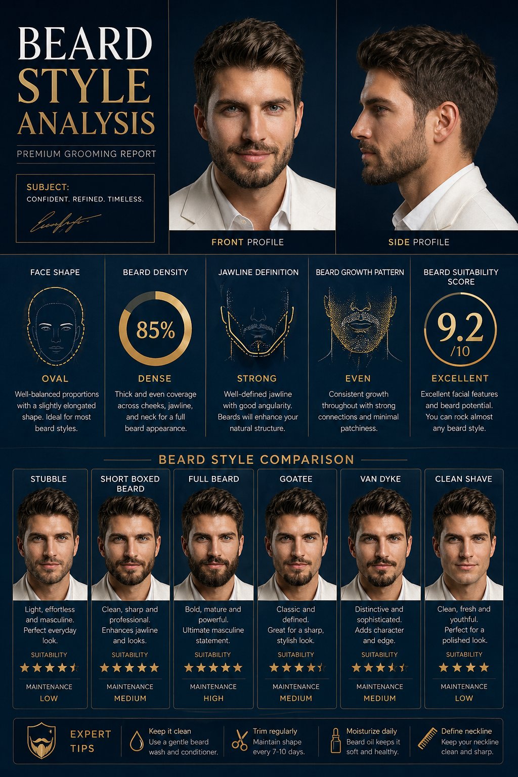
胡须风格分析海报
Posters & Typography
胡须风格分析海报
Posters & Typography
Create a premium “BEARD STYLE ANALYSIS” poster featuring the same man from the reference image. Show face shape, beard density, jawline definition, beard growth pattern, and beard suitability score. Include different beard styles comparison such as Stubble, Short Boxed Beard, Full Beard, Goatee, Van Dyke, Clean Shave. Add side profile and front profile views. Modern dark blue luxury background, professional grooming infographic style, high detail, realistic face consistency, stylish typography, premium male grooming poster.
@RizwanAly07
暂无图片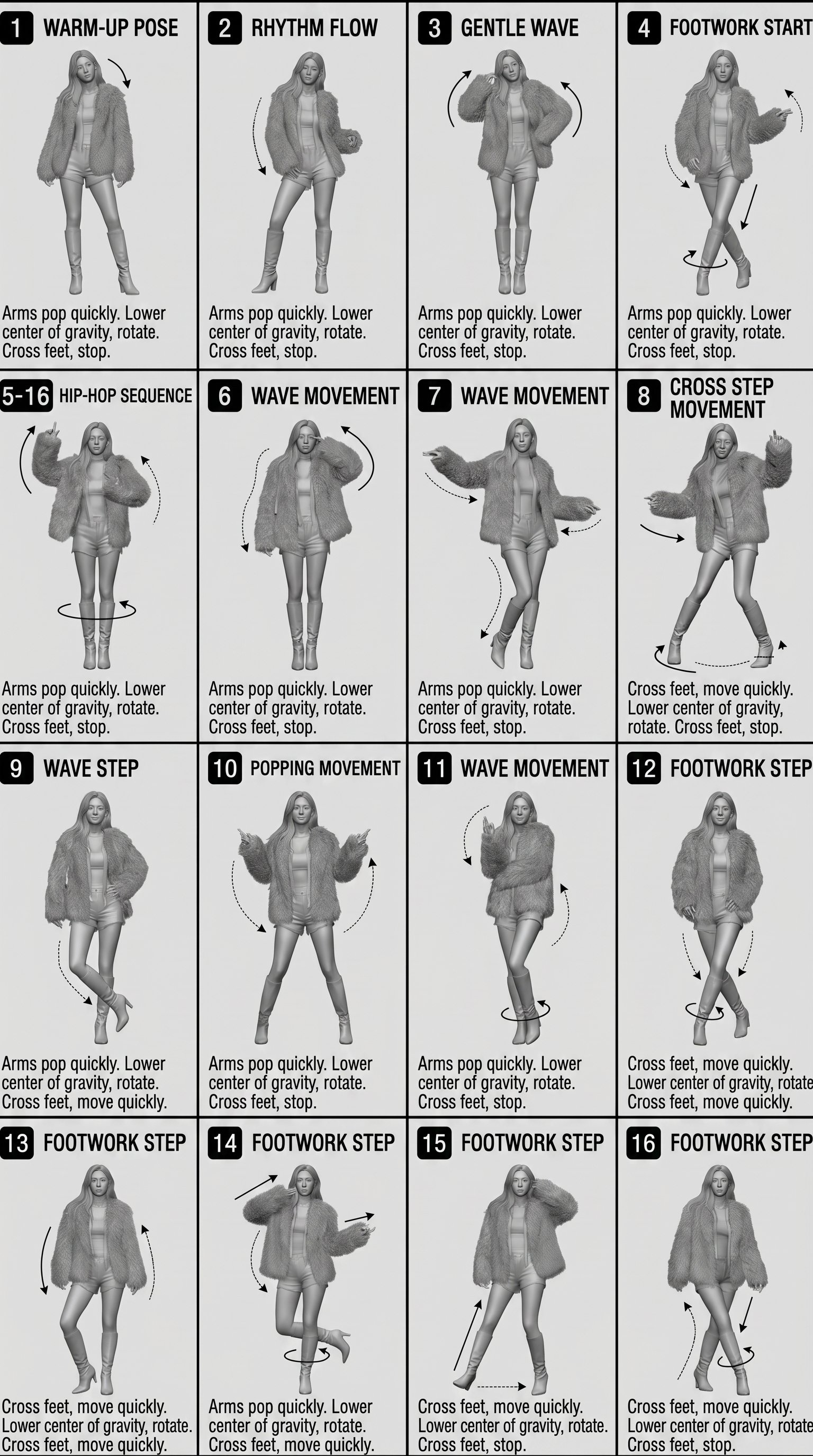
4×4 动作分解参考表
Characters & People
4×4 动作分解参考表
Characters & People
[STYLE] Monochrome grayscale illustration, 3D-rendered character, clean instructional reference sheet, white background, comic-style cell grid layout, technical diagram aesthetic. [LAYOUT] 4×4 grid layout with a total of 16 panels. Each panel is separated by thin black border lines. Cells are numbered from 1 to 16, with consistent panel sizes. [CHARACTER] image1 (the same character appears consistently in all panels) [PANEL STRUCTURE – per cell] Top-left: bold number badge + English title text Center: full-body character pose illustration Bottom-left: English description text (3–4 lines) Overlay: directional arrows indicating movement [ARROWS / MOTION INDICATORS] Curved arrows, straight arrows, and circular rotation indicators placed around the character to show motion flow and direction. [RENDERING STYLE] Highly detailed 3D sculpted style, soft studio lighting, subtle shadows, no color, grayscale shading, clean linework, game concept art quality. [NEGATIVE] No background scenery, no color tones, no additional characters, no complex background.
@oggii_0
暂无图片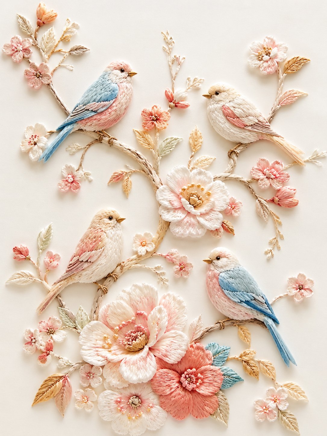 精选
精选立体刺绣小鸟花枝
Illustration & Art
精选立体刺绣小鸟花枝
Illustration & Art
精致立体刺绣风插画,浅浮雕纤维艺术效果,纯净「蚕丝白 + 奶白」底色,细腻丝线质感。画面为数只小鸟停在蜿蜒花枝上,周围点缀粉白、浅桃、珊瑚粉、淡金色花朵与叶片,构图轻盈雅致、留白充足。鸟儿羽毛以奶白、浅蓝、淡粉、浅金丝线刺绣表现,花枝纤细自然,花朵层层叠线,整体呈现高级手工刺绣、丝线堆绣、柔和光影、细节丰富、温柔清新的艺术效果。
@dotey
暂无图片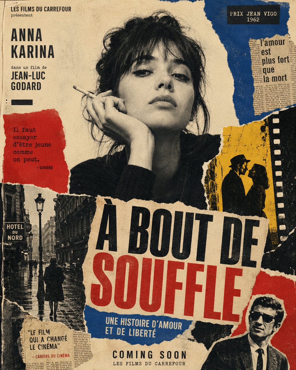
法新浪潮撕纸电影海报
Posters & Typography
法新浪潮撕纸电影海报
Posters & Typography
Create a vertical poster composition on aged cream paper with a handmade analog feel. Use rough ripped paper edges, layered magazine cutouts, photocopy grain, halftone texture, ink bleed, and slightly imperfect screen-print registration. Keep the subject as the main black-and-white photographic portrait, placed prominently in the center or upper center. Surround the subject with graphic blocks of deep red, cobalt blue, warm yellow, black, and ivory. Add supporting collage fragments such as a rainy European street, film-strip borders, newspaper clippings, urban silhouettes, and cinematic details, arranged like a handmade 1960s art-house movie poster. Use bold condensed typography with a strong visual hierarchy. Add large headline text: "[MAIN TITLE]". Add smaller subtitle text: "[SUBTITLE]". Add bottom text: "[BRAND NAME / EVENT NAME / COMING SOON / DATE]". If needed, include a small top line reading "[TAGLINE]". The final result should feel cinematic, intellectual, rebellious, and editorial — like a lost 1960s European film poster with a strong point of view. Keep it raw, tactile, printed, imperfect, and handmade. Avoid a glossy modern finish.
@bananaprompts
暂无图片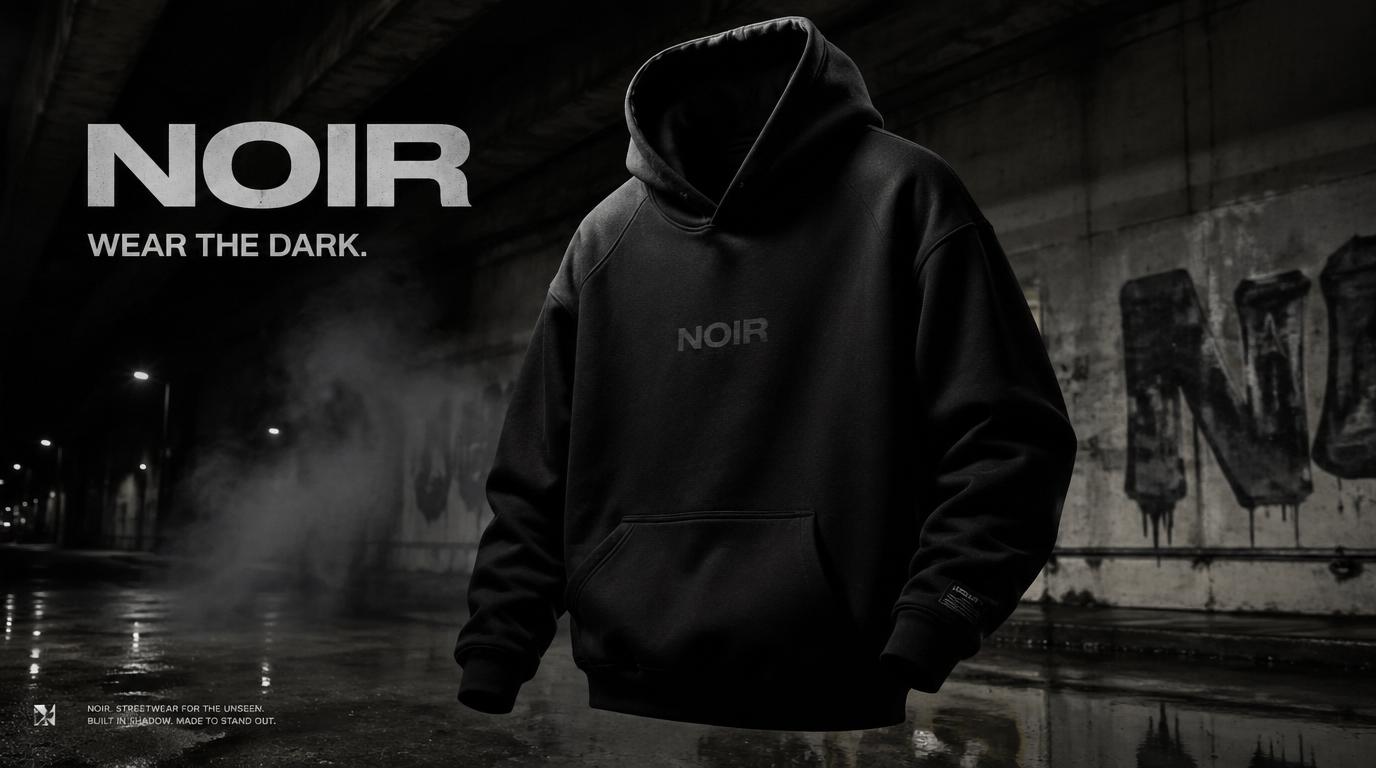 精选
精选NOIR 街头服饰 Campaign
Brand & Logos
精选NOIR 街头服饰 Campaign
Brand & Logos
Create a premium, highly realistic 1:1 campaign poster for NOIR, a modern streetwear brand. Show one hero oversized hoodie as the main focus against a gritty urban backdrop with wet concrete floors, dramatic low lighting, subtle smoke in the air and a raw street energy. Add bold minimal typography with the brand name NOIR and a short campaign headline like "Wear the Dark." Make it feel like a real high-end streetwear editorial, sharp detail, realistic fabric textures, modern and edgy, deep black tones with subtle grey accents, no clutter, no collage.
@Daniel_adsss
暂无图片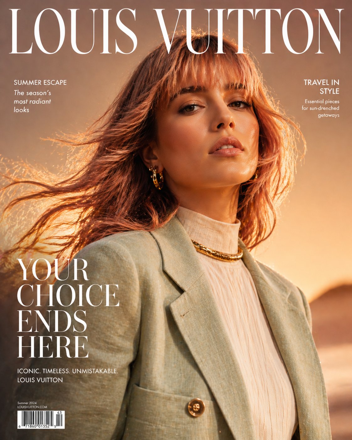
高定时尚杂志封面
Posters & Typography
高定时尚杂志封面
Posters & Typography
Ultra high-fashion magazine cover, Louis Vuitton-style editorial. Close-up portrait of a confident woman with soft rose-gold hair and natural airy bangs, slightly wind-blown for movement. She is wearing a luxury summer outfit: a structured lightweight linen or silk jacket in warm golden-yellow tones, layered over a modest high-neck top, paired with a bold gold choker necklace and subtle statement earrings. Fabric flows naturally with a summer breeze, slightly textured and breathable, capturing a premium seasonal feel. Styling is elegant, modest, and refined — no revealing clothing. Lighting is high-end studio mixed with natural golden hour glow: warm highlights, soft shadows, luminous skin with glossy editorial finish. Background is a rich summer gradient (sunset gold fading into soft coral or warm beige), clean but visually striking. Composition is dynamic and slightly cinematic: hair in motion, shallow depth of field, sharp focus on face. Typography: large elegant serif masthead "Louis Vuitton" at the top, bold cover line "YOUR CHOICE ENDS HERE" in premium editorial layout, minimal supporting text. Ultra-realistic, hyper-detailed skin texture, 8K resolution, sharp focus, glossy magazine print quality, cinematic color grading, luxury fashion photography, no nudity, tasteful and editorial.
@SPEEDAI07
暂无图片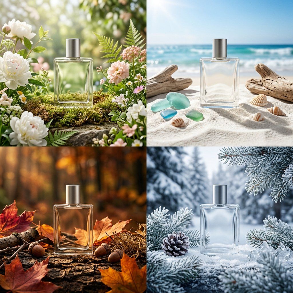
四季包装 Campaign 宫格
Brand & Logos
四季包装 Campaign 宫格
Brand & Logos
PHASE 1 - PRODUCT: [ITEM] in [MATERIAL] packaging, minimal label design PHASE 2 - GRID: 2x2 seasonal grid, four distinct brand worlds PHASE 3 - COMPOSITION: each quadrant a full campaign scene with props and environment PHASE 4 - CONSISTENCY: same product silhouette, four distinct palettes Swap: [ITEM] / [MATERIAL] / [LABEL STYLE]
@SRKDAN
暂无图片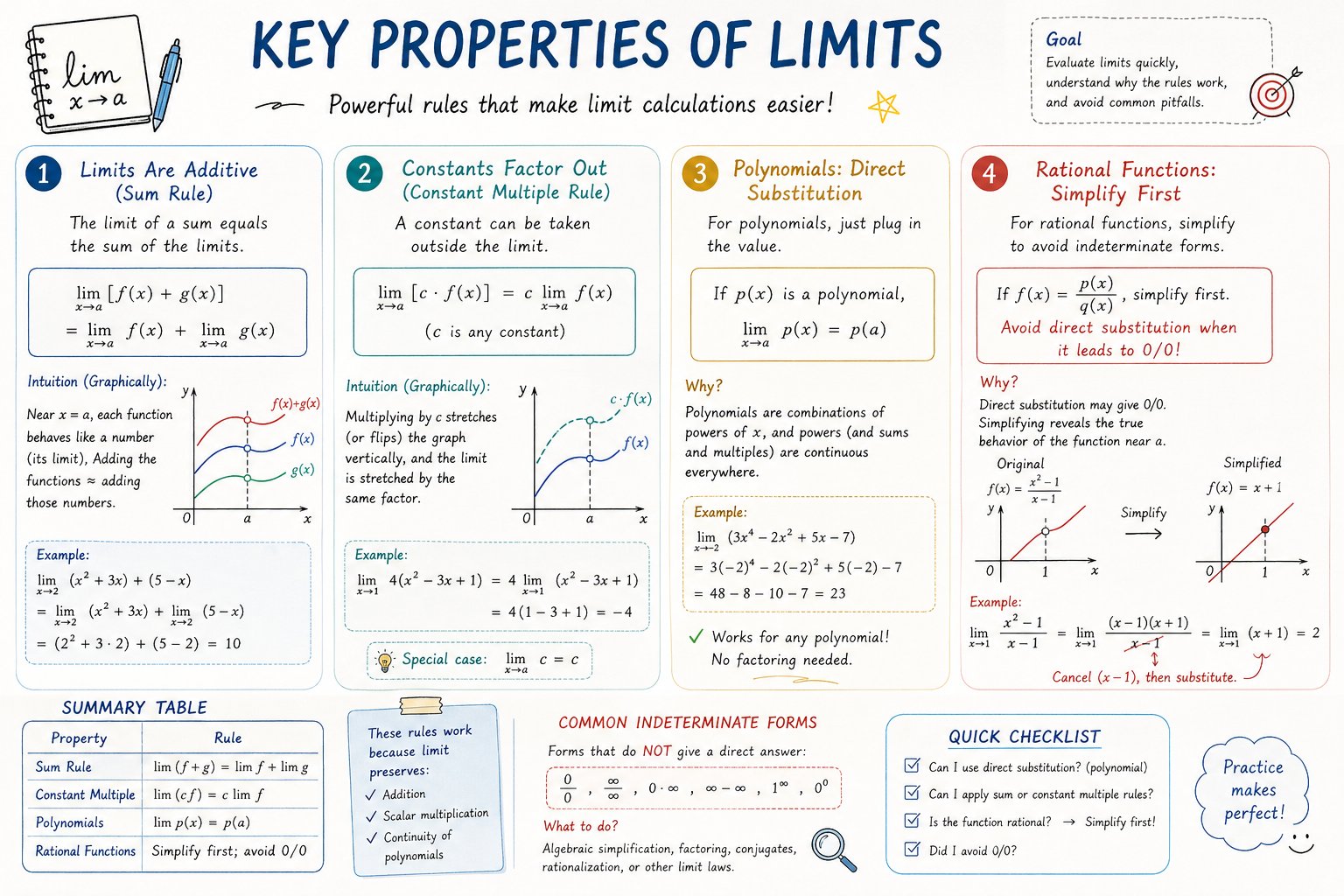 精选
精选AP Calculus 学习表信息图
Charts & Infographics
精选AP Calculus 学习表信息图
Charts & Infographics
Please create a mathematical visualization infographic about "[math concept / topic]." The goal is to help the viewer intuitively understand what it is, why it works, its geometric or structural intuition, and how it behaves in different contexts. The visual should feel like a high-quality math lecture handout combined with a hand-drawn educational poster. It should be elegant, clear, and information-rich, but not cluttered. Visual style: either portrait or landscape is fine. Use a clean, light paper-like background, with a deep blue title and black or dark gray lines for the main content. Add a small number of refined accent colors such as blue, teal, gold, and red. Incorporate rounded-corner cards, thin borders, numbered labels, hand-drawn arrows, zoom-in callout boxes, and a summary section. The overall design should be aesthetically pleasing, balanced, and academic, allowing the viewer to grasp the structure of the concept and why it works at a glance.
@hqmank